


Description
Payment & Security
Your payment information is processed securely. We do not store credit card details nor have access to your credit card information.
You may also like
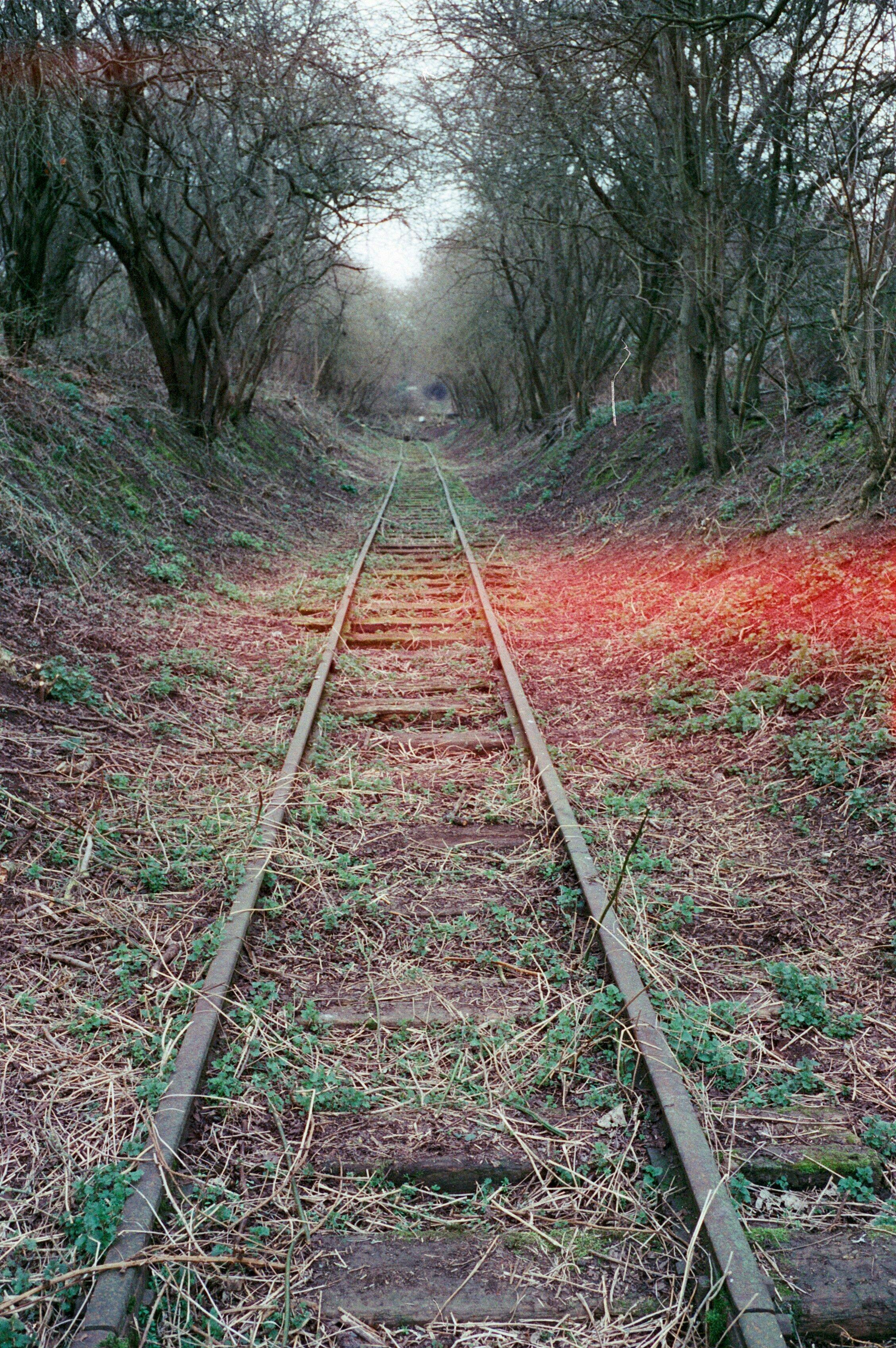
Quite unpredictable with some quality control issues. It doesn't appear to have a lot of latitude and some of my images had light leaks (I don't believe this is the camera as I haven't had it with any other film) There's also some halation in sunlit scenes which makes me assume this is another repackaged movie film with remjet removed.
A few more pictures taken with the Candido 400 film. If you are looking for a film with vintage vibes then look no further. Candido 400 won't disappoint you. The only use that this film is not for is portraits.


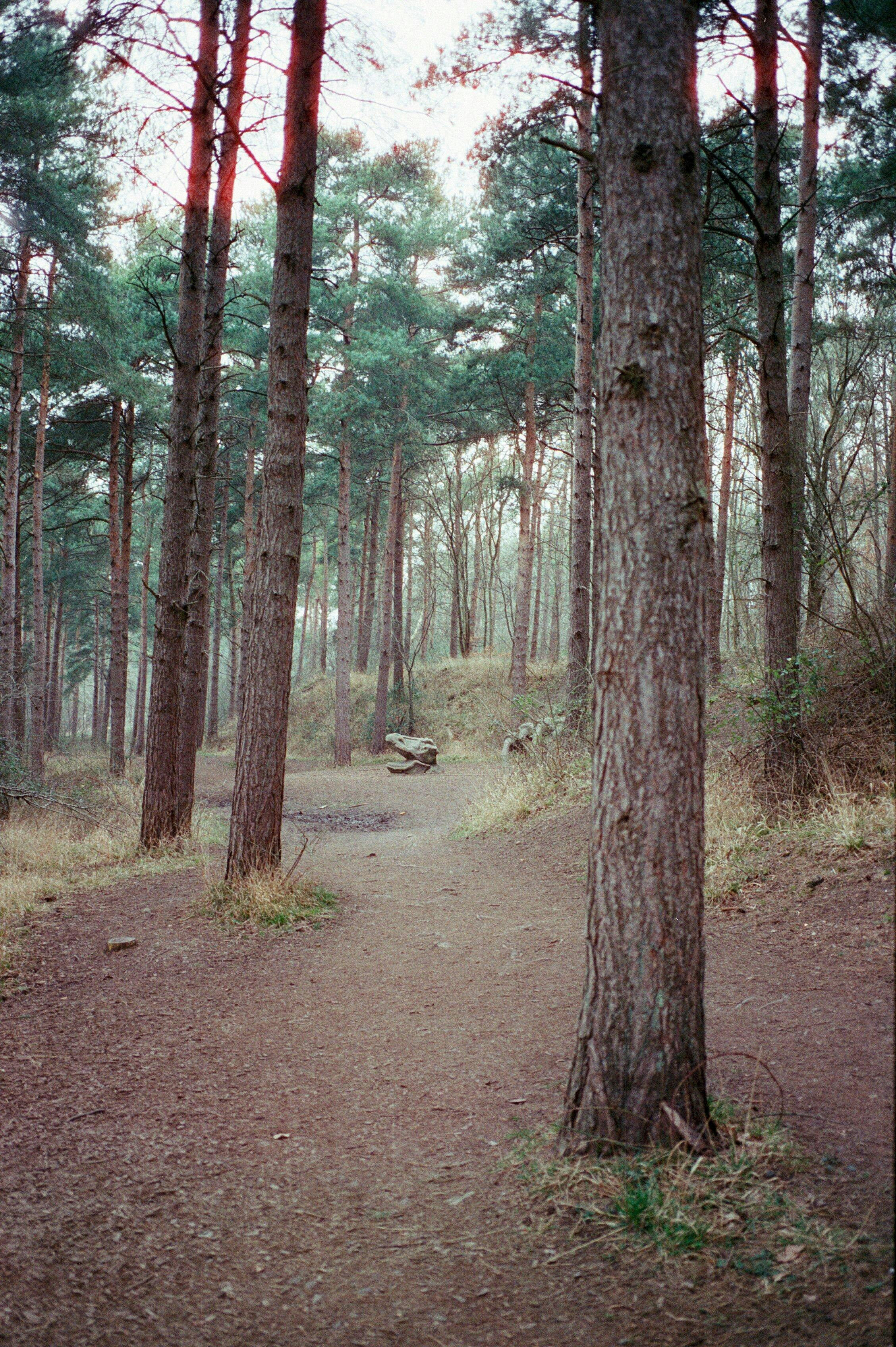
Another CANDIDO 400 roll developed and here's my updated review of this film stock. If you are looking for a true vintage look then this may be for you. The grain is fine for a 400, the colour rendering is perfect if you'd like to achieve a vintage look that is imperfect yet beautiful.
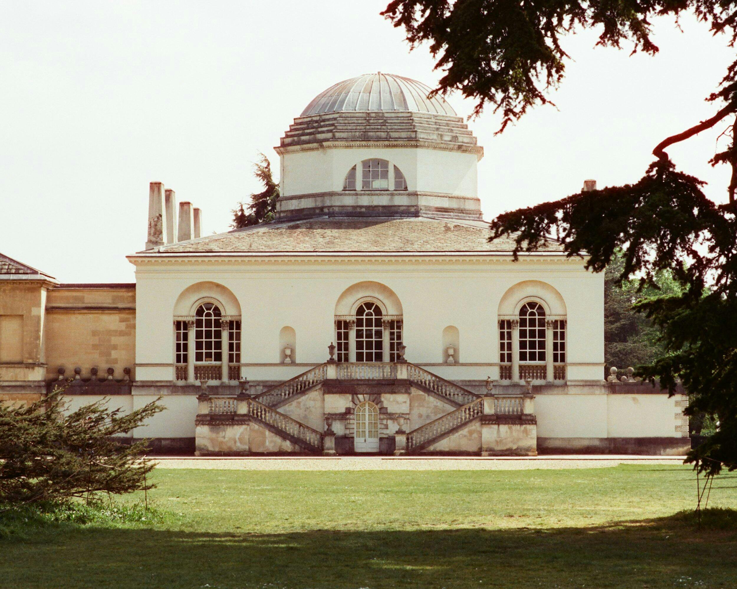


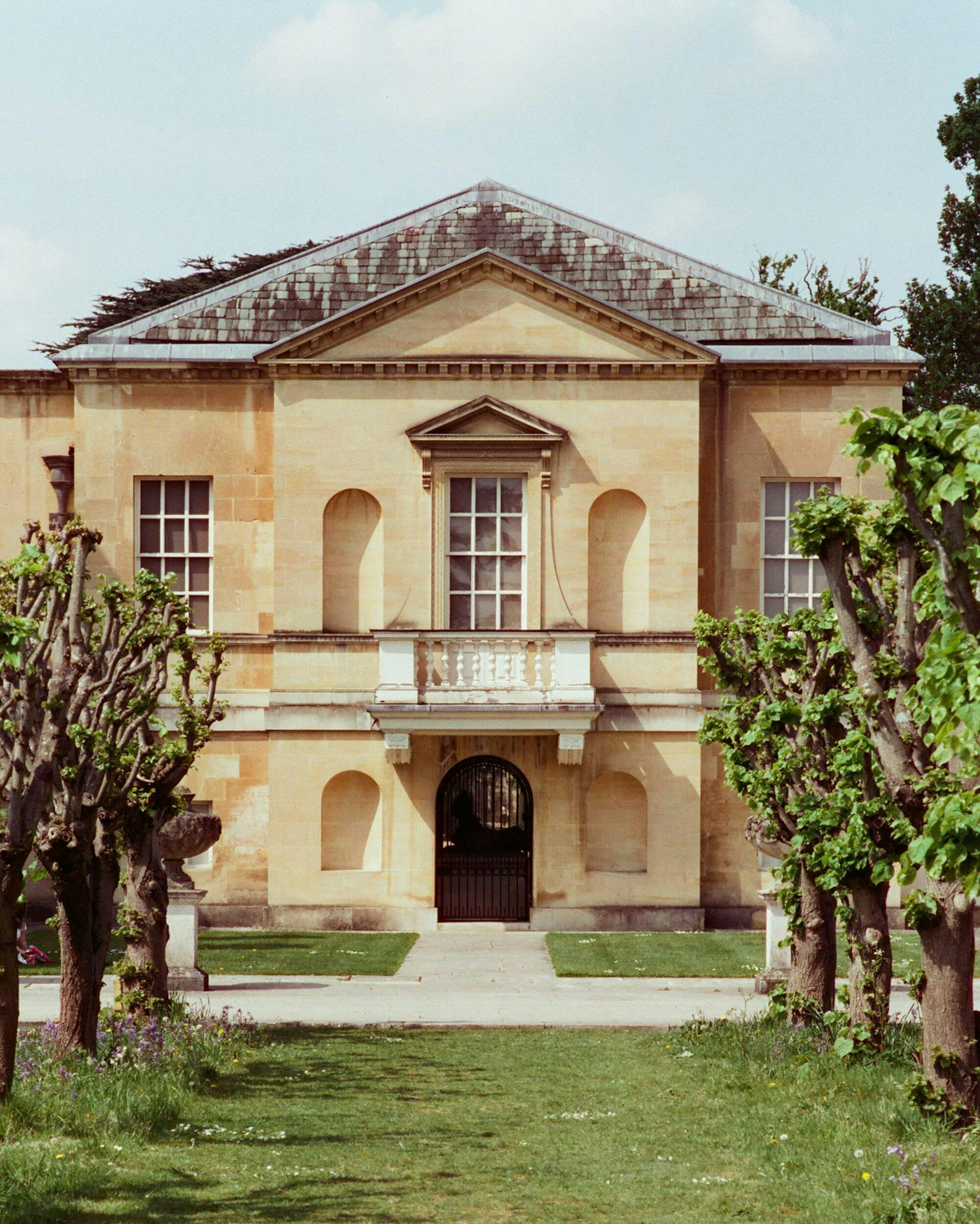
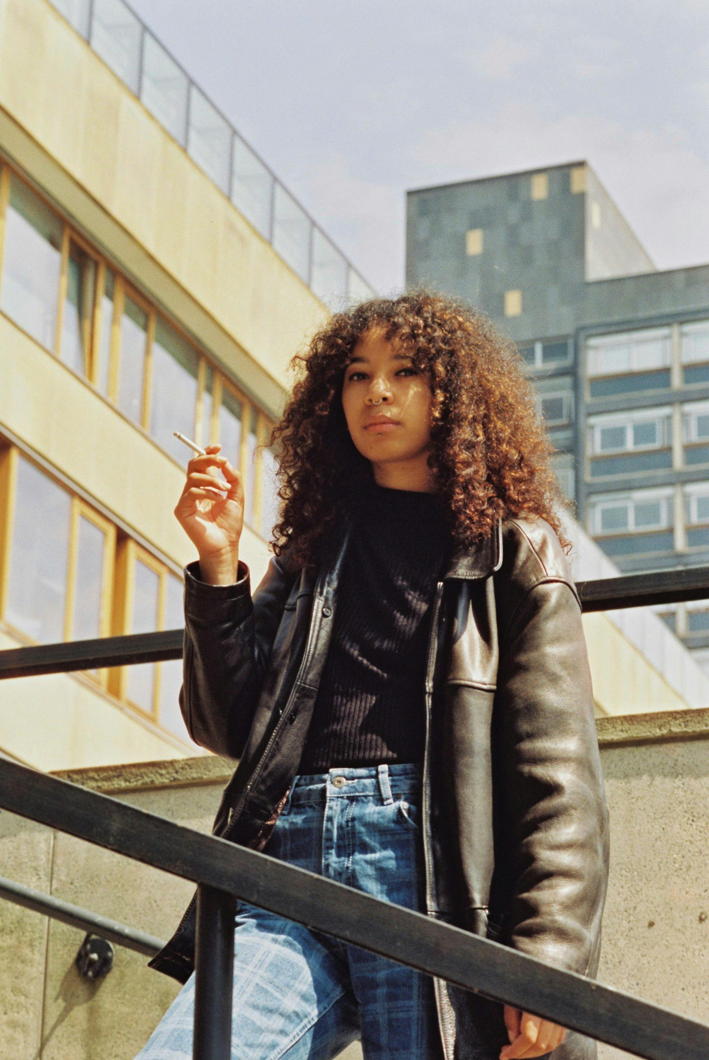
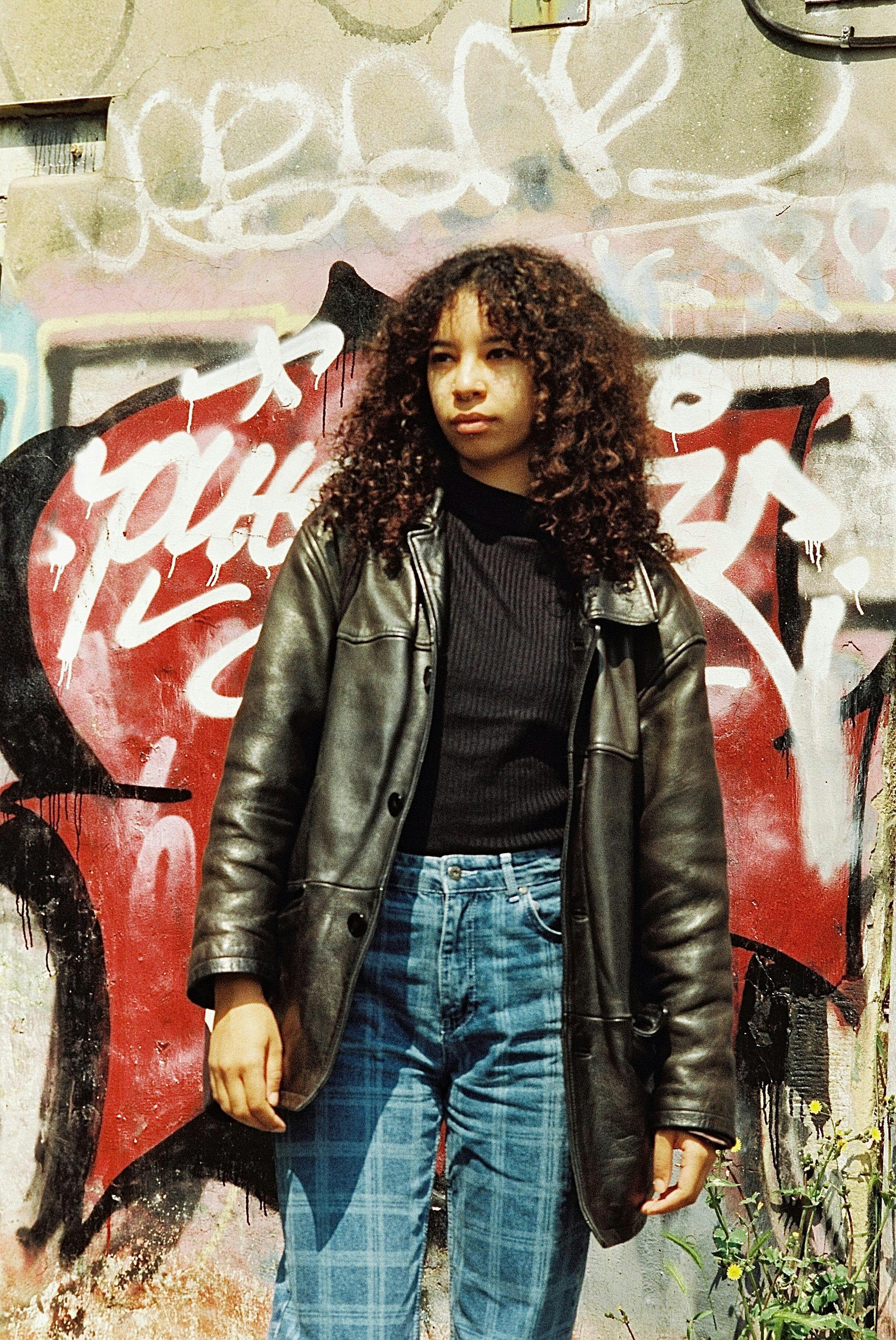
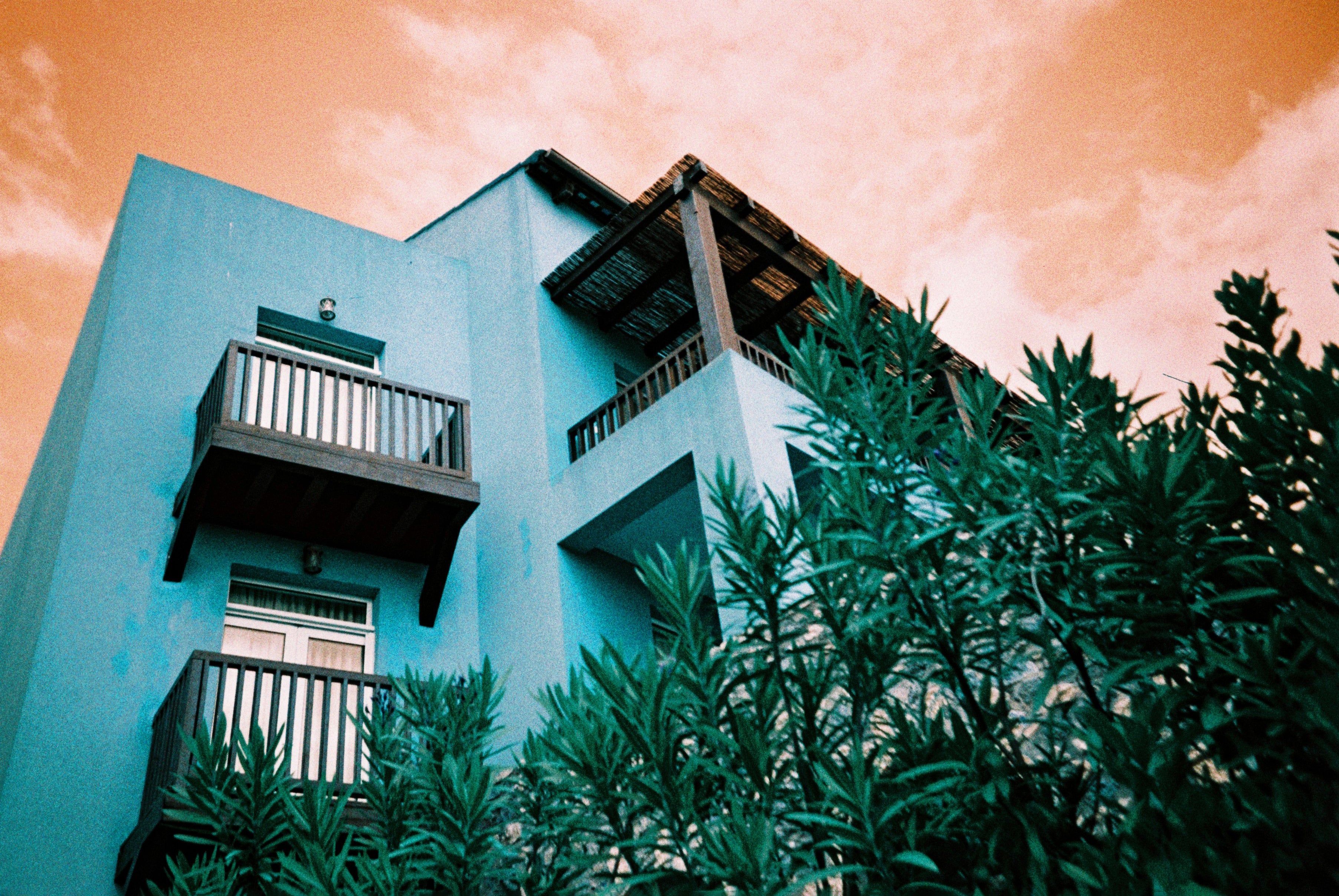
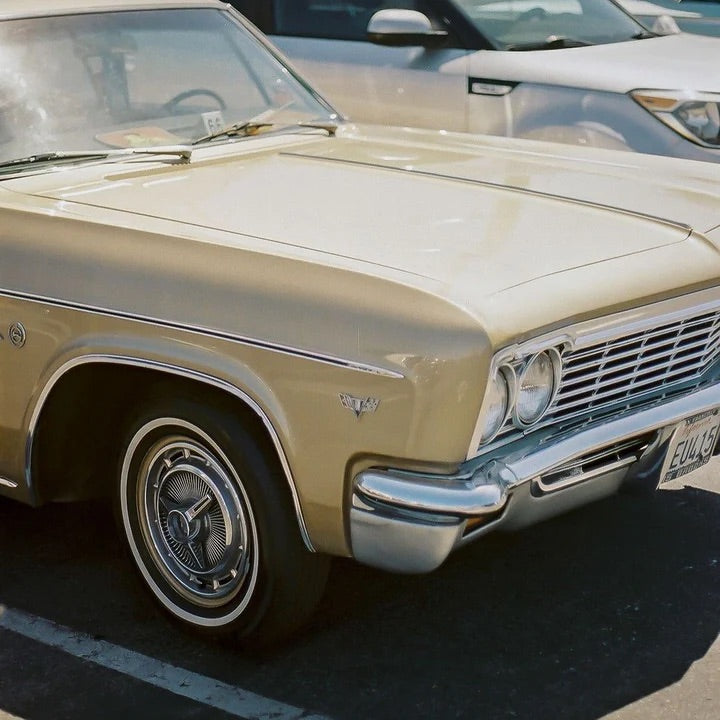
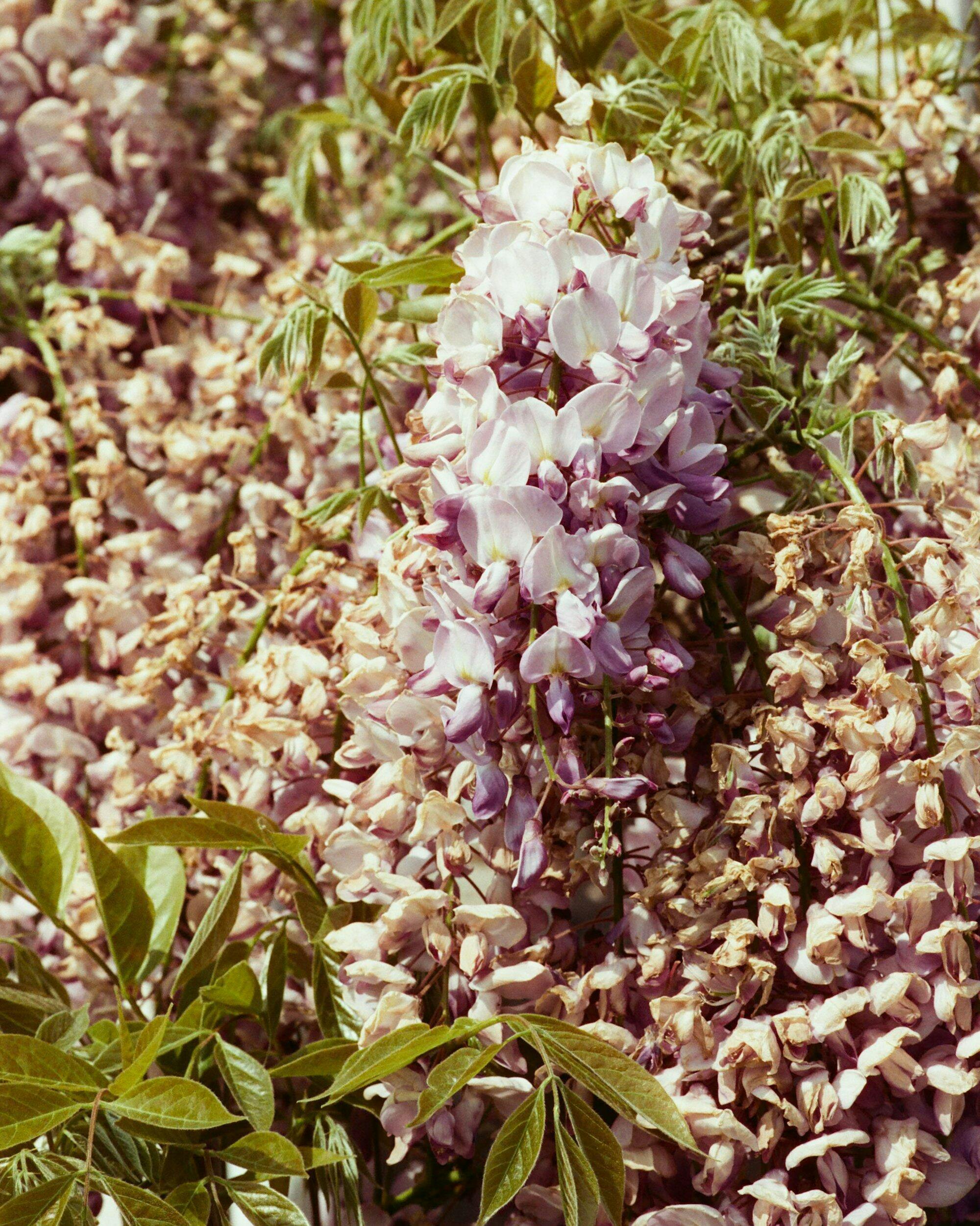
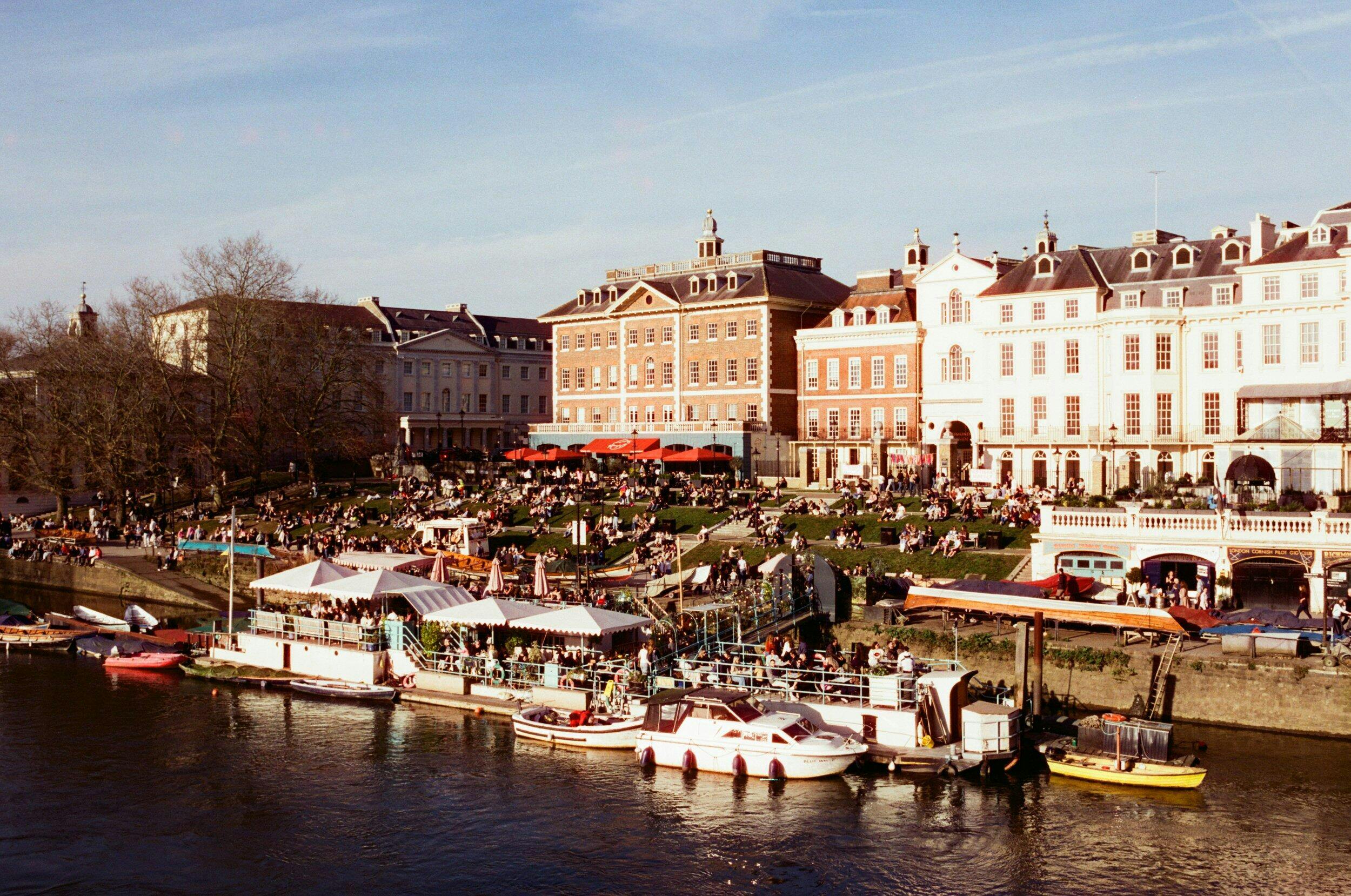
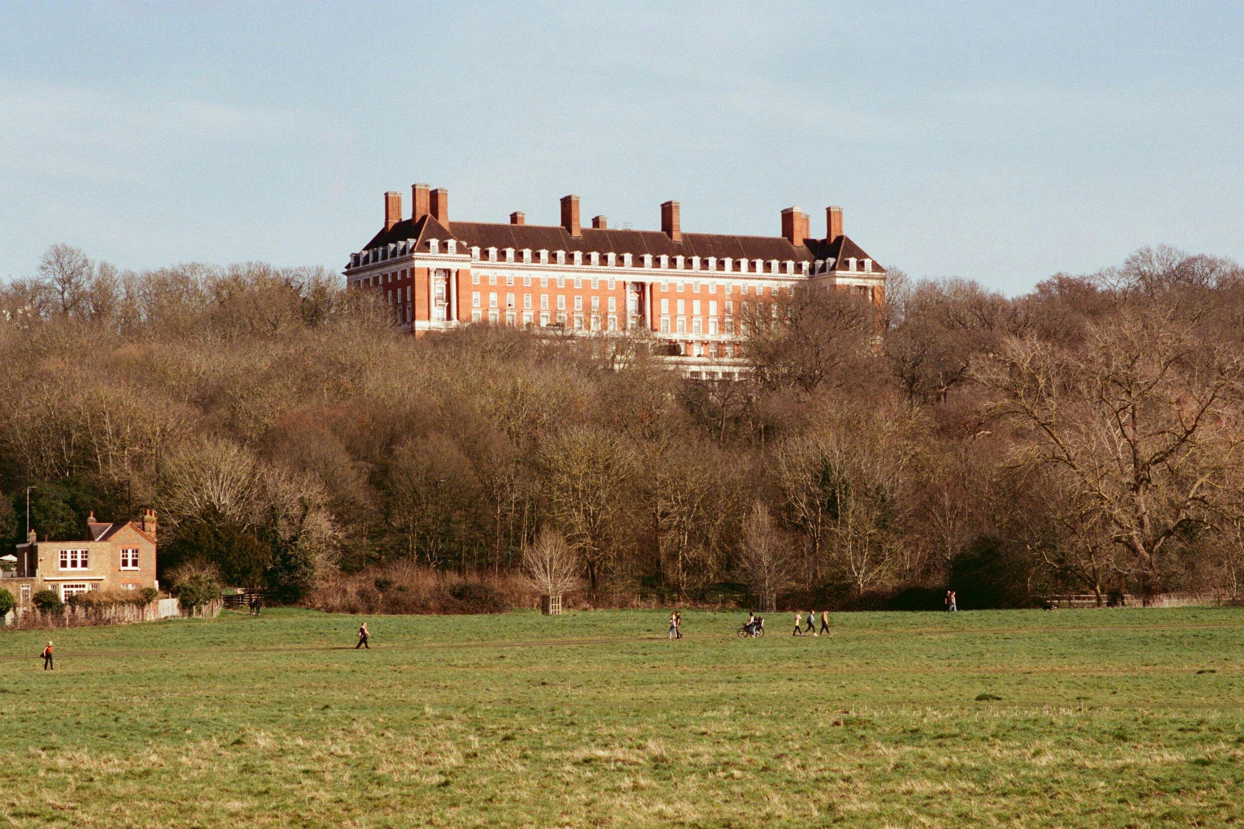
Candido 400 delivers what I’d describe as an unapologetically nostalgic look. The tones are warm, a little soft around the edges, and they lend a kind of subtle, retro atmosphere that doesn’t feel overly stylised. Compared to some of the punchier consumer stocks like Kodak UltraMax 400, Candido has a more subdued palette that really flatters late afternoon light and early blossoms.
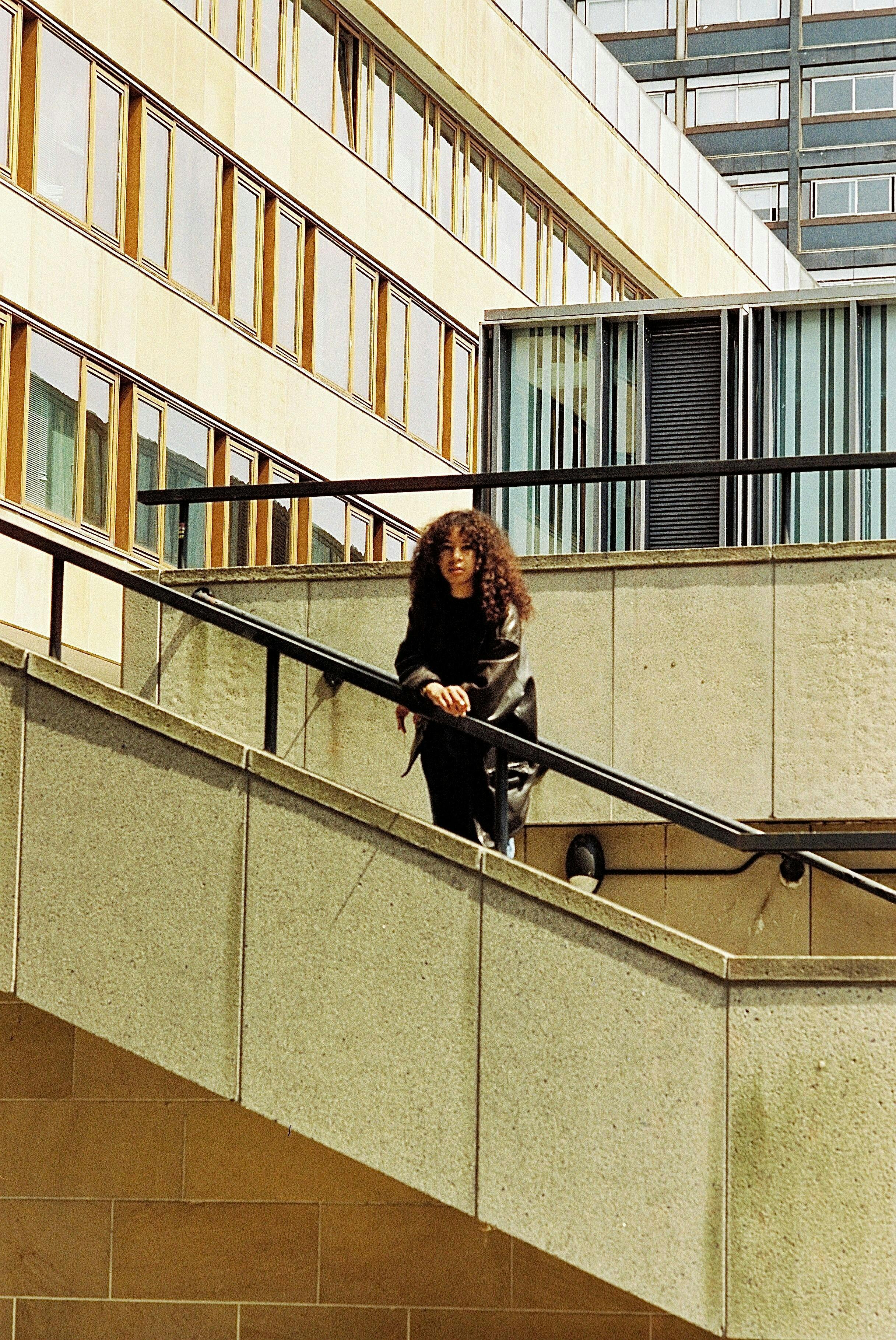
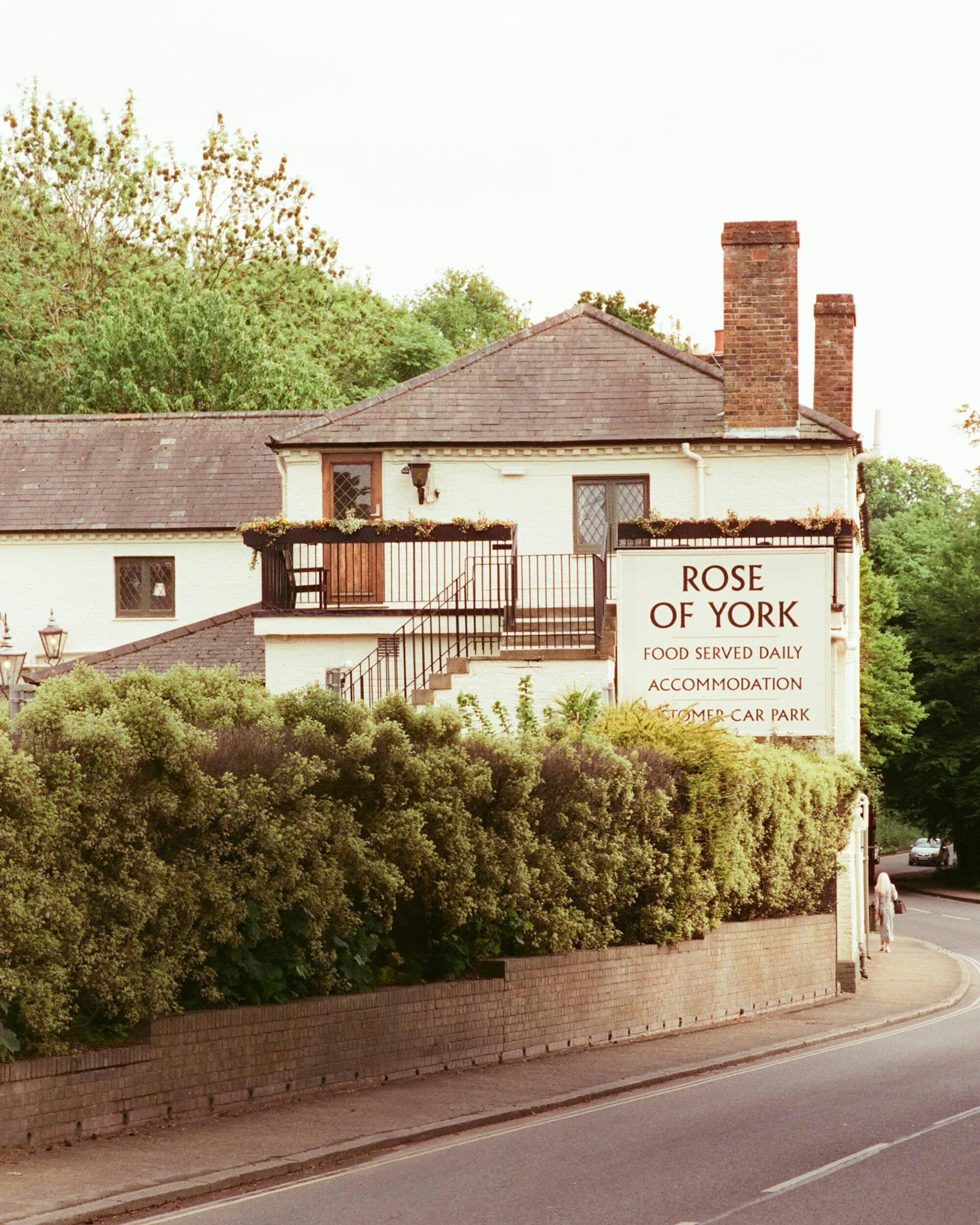
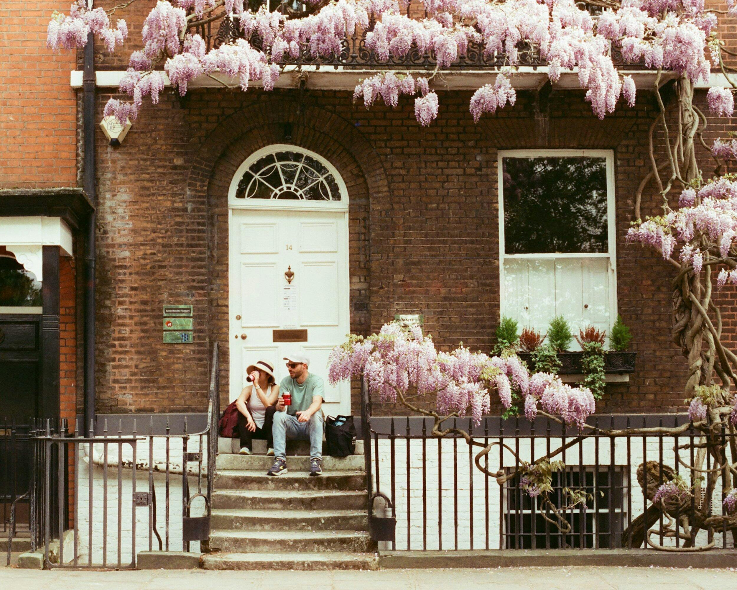
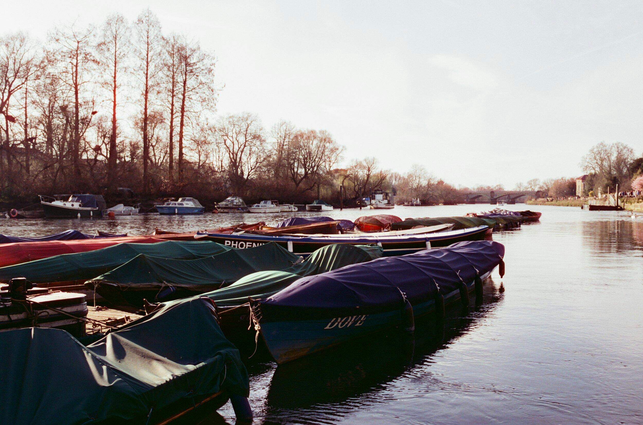
In the shots featured in this blog post—from moored boats along the Thames to the energy of a crowded riverside terrace—you can see how the film adds a muted charm without flattening the contrast. There’s still depth and clarity in the shadows, and the highlights roll off quite gently.
After getting the negatives developed and scanned at the lab, I noticed one thing right away: the blues were slightly off. Skies leaned too cyan, and shadows had a hint of magenta, which felt a bit unnatural. I did some minor corrections in Lightroom, mostly adjusting the blue curve to neutralise things. Once balanced, the color profile became much more pleasing—closer to the “vintage postcard” aesthetic that this film seems to aim for.
Performance notes:
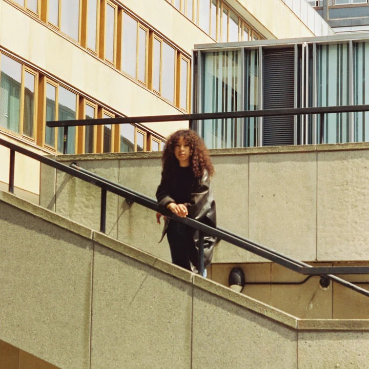
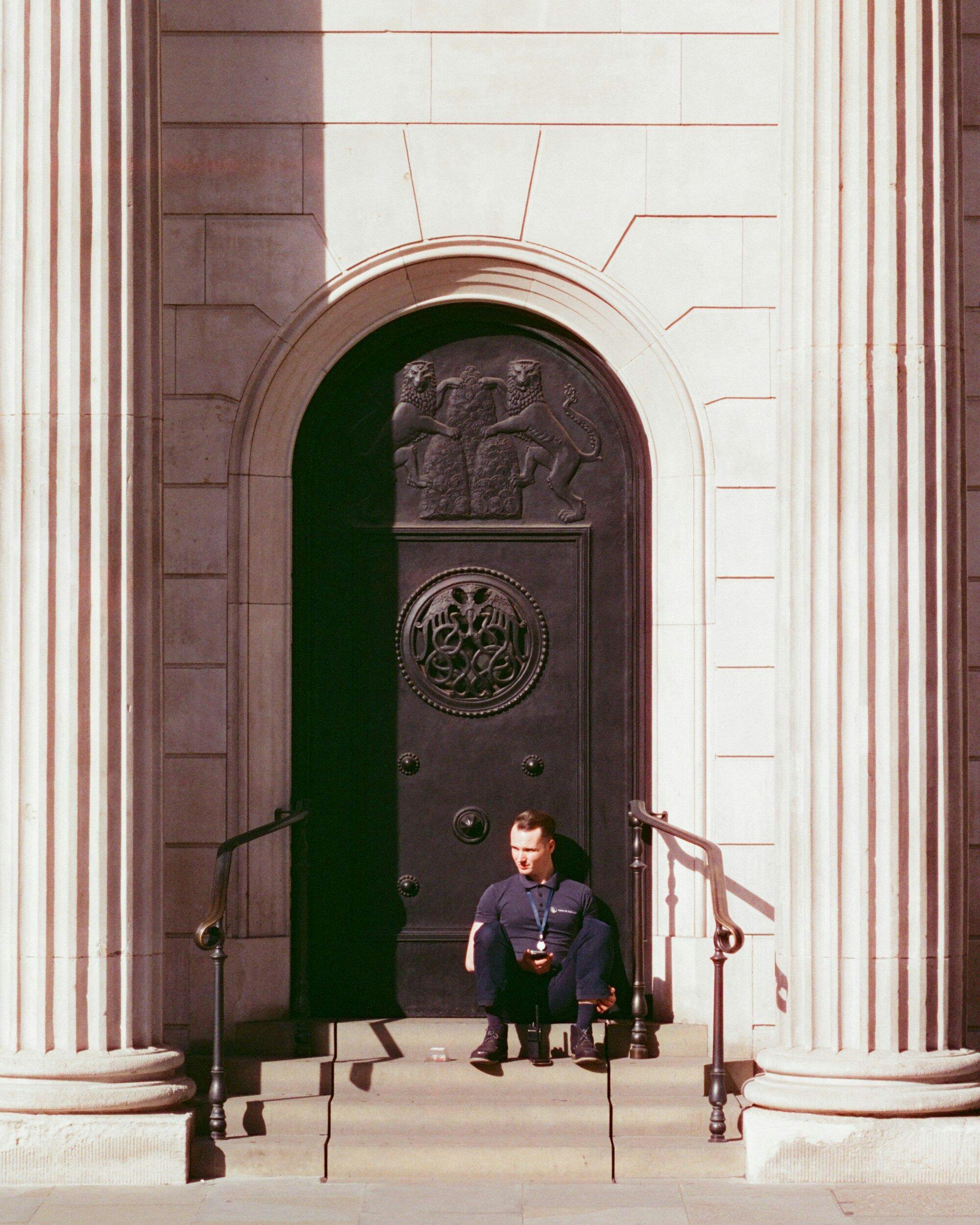
Grain: It’s present but fine—more texture than noise. Especially on the 50mm and 85mm, the grain adds character without overwhelming detail.
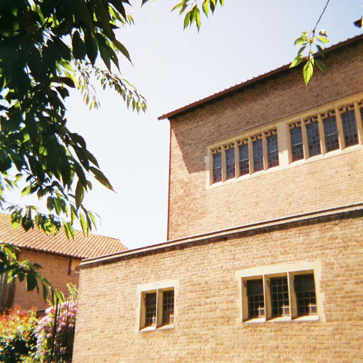
Latitude: Midtones are where this film shines. Shadows retain a surprising amount of detail for a 400-speed film, but highlights can blow if you’re not careful in strong sunlight.
Skin Tones: Warm and a bit pink-leaning. Great for casual portraits, though perhaps less ideal for studio-style precision.
Final thoughts:
Candido 400 may not have the name recognition of Kodak or Fuji, but for photographers looking for a stock that delivers personality and a sense of timelessness, it's a fun one to experiment with. Paired with the Nikon F80—which was a dream to shoot with, by the way—the film gave me exactly the kind of soft, romantic imagery I was hoping for.

Enjoyed using the film. Luckily one of my photos have been used as samples. It’s a good film with a good price point.