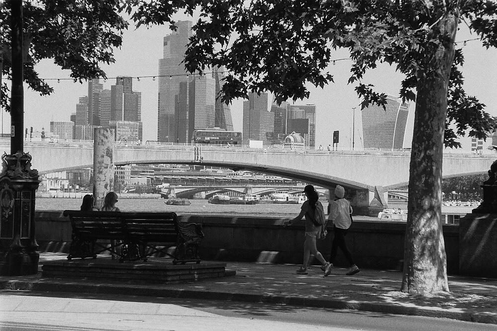
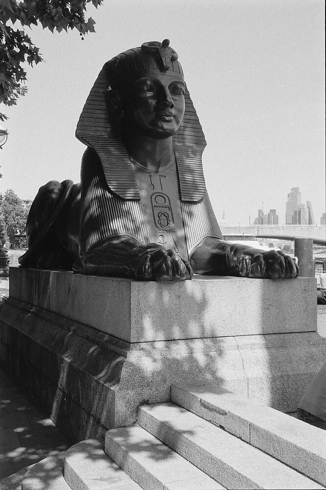
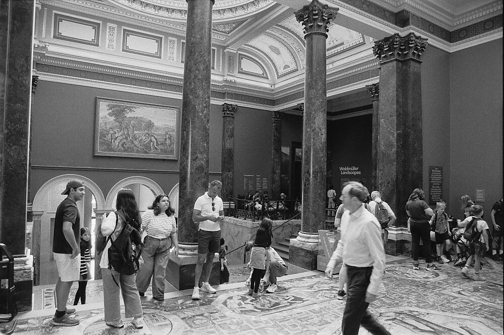
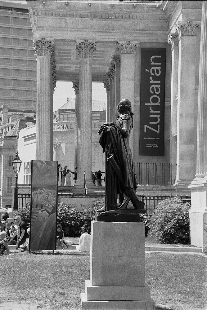
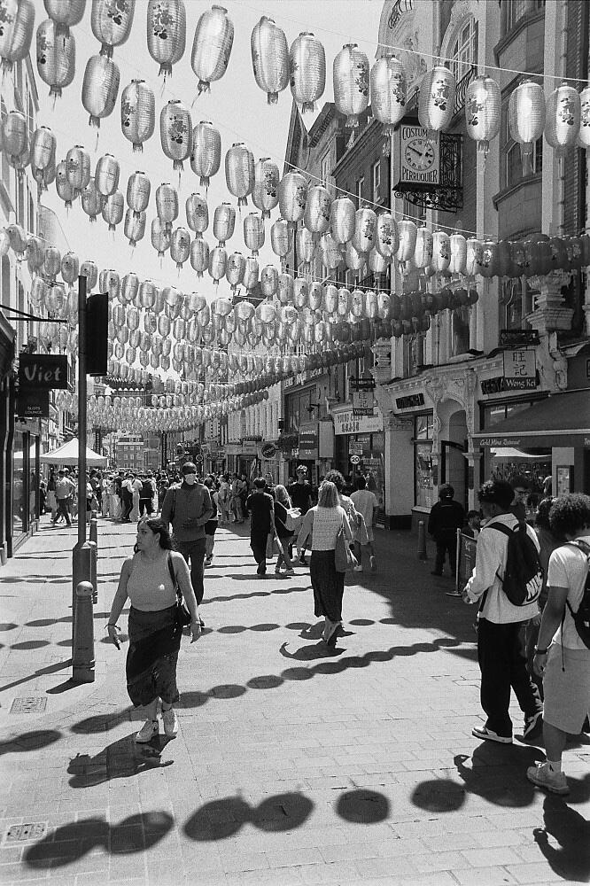
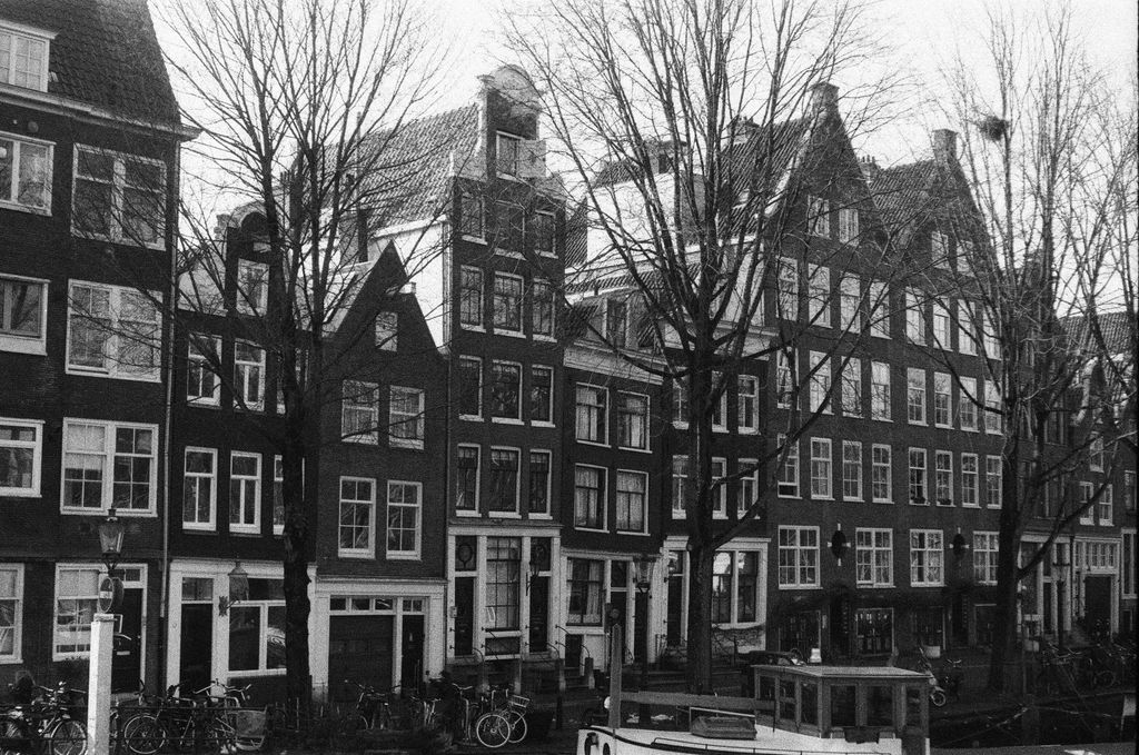
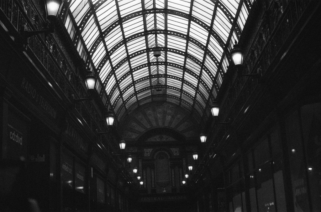
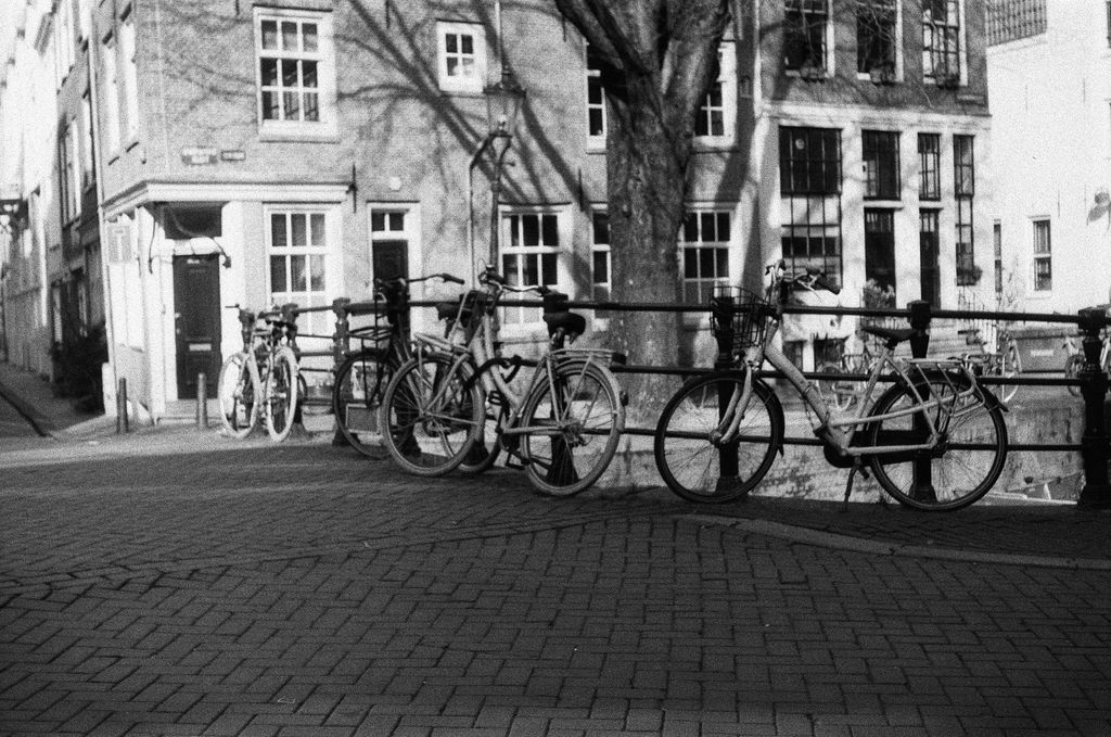
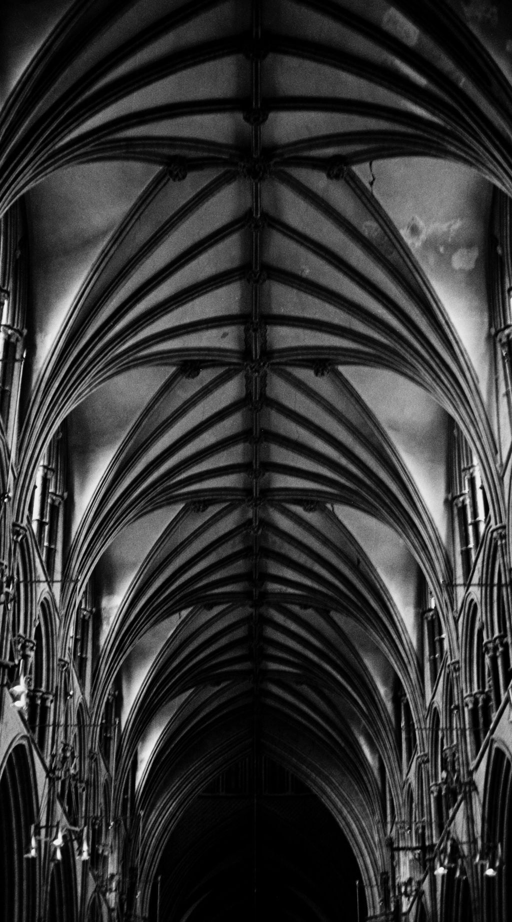
Black and White film photography can be an acquired taste. It doesn't have the clean sharpness and resolution of digital B&W. Grain, contrast, lack of detail...it is easy to give up on it as it can seem inferior to shooting colour. And yet others have clearly got some great shots from HP5 and Tri-X etc. I have sampled a lot of different B&W film stocks and while that has been fun to do, if I want reliable results I use RPX400. It looks great straight out of camera. It has incredible resolution for capturing detail. It is easy to add a little more contrast without getting grainy results. Much of the time it appears almost grainless. It is 400 iso but looks like 100 iso film. It is particularly good for street, architecture and interiors I have found. It is my go-to B&W film. If you have tried B&W but not liked the results, I recommend you trying this film.
My first time shooting Kodak Gold, as I usually stick to black and white. I really enjoyed the warm colours and classic look - it was a fun change of pace.
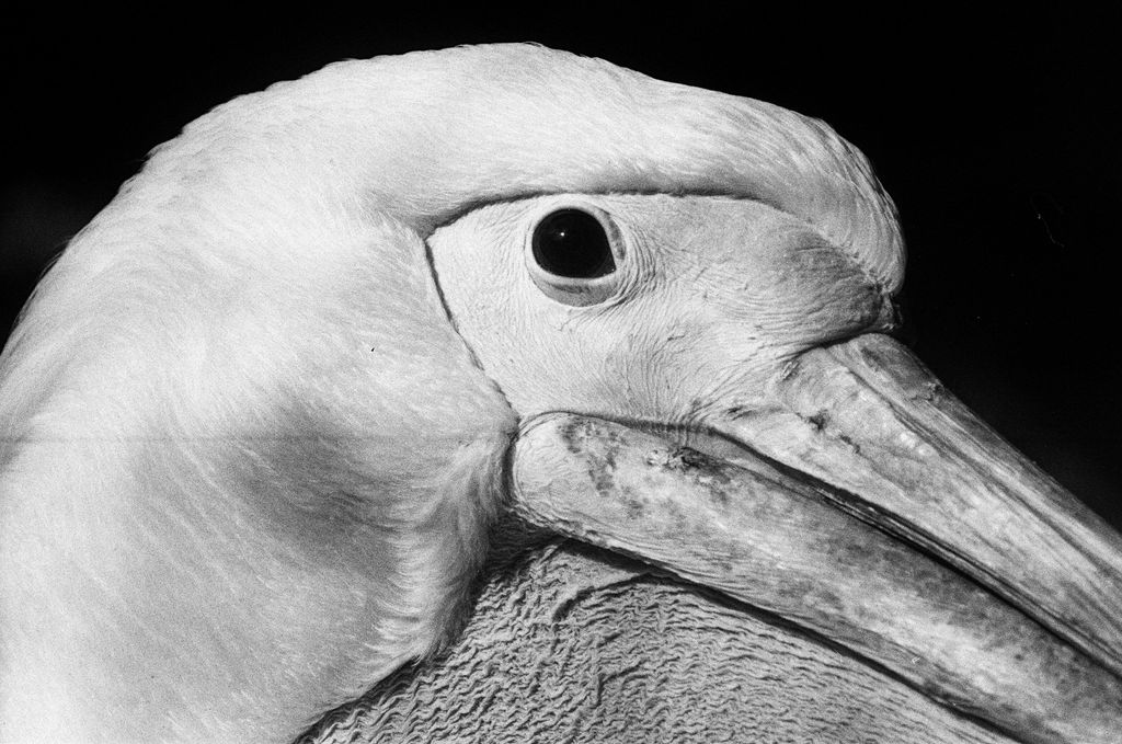
Love this film. My go-to black and white stock - beautiful tones, fine grain, and always reliable.
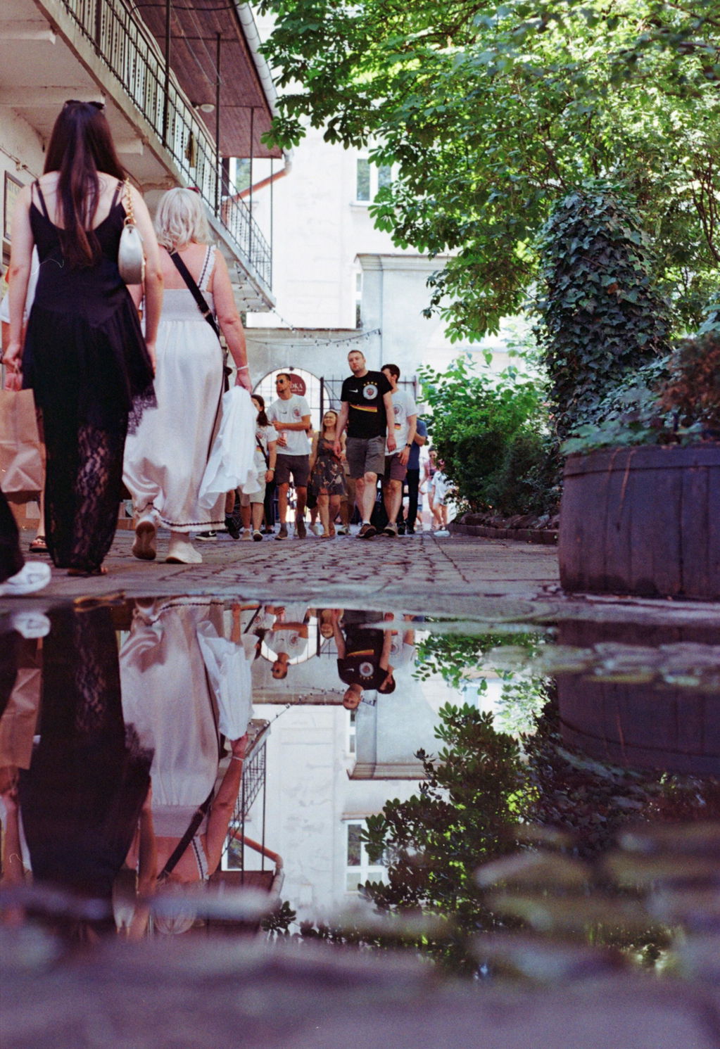
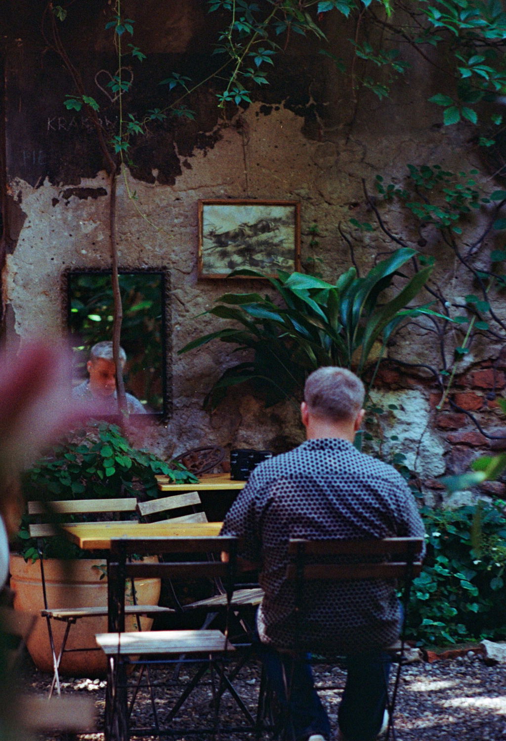
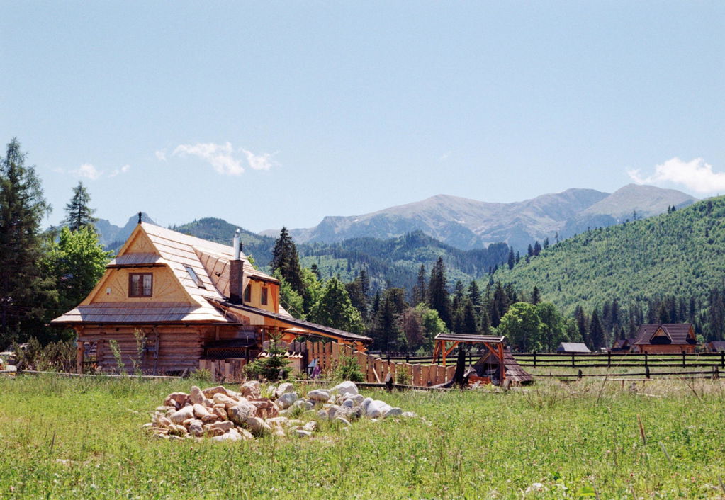
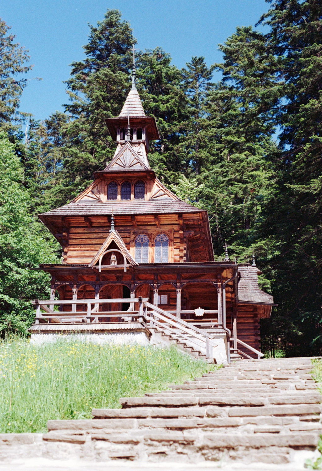
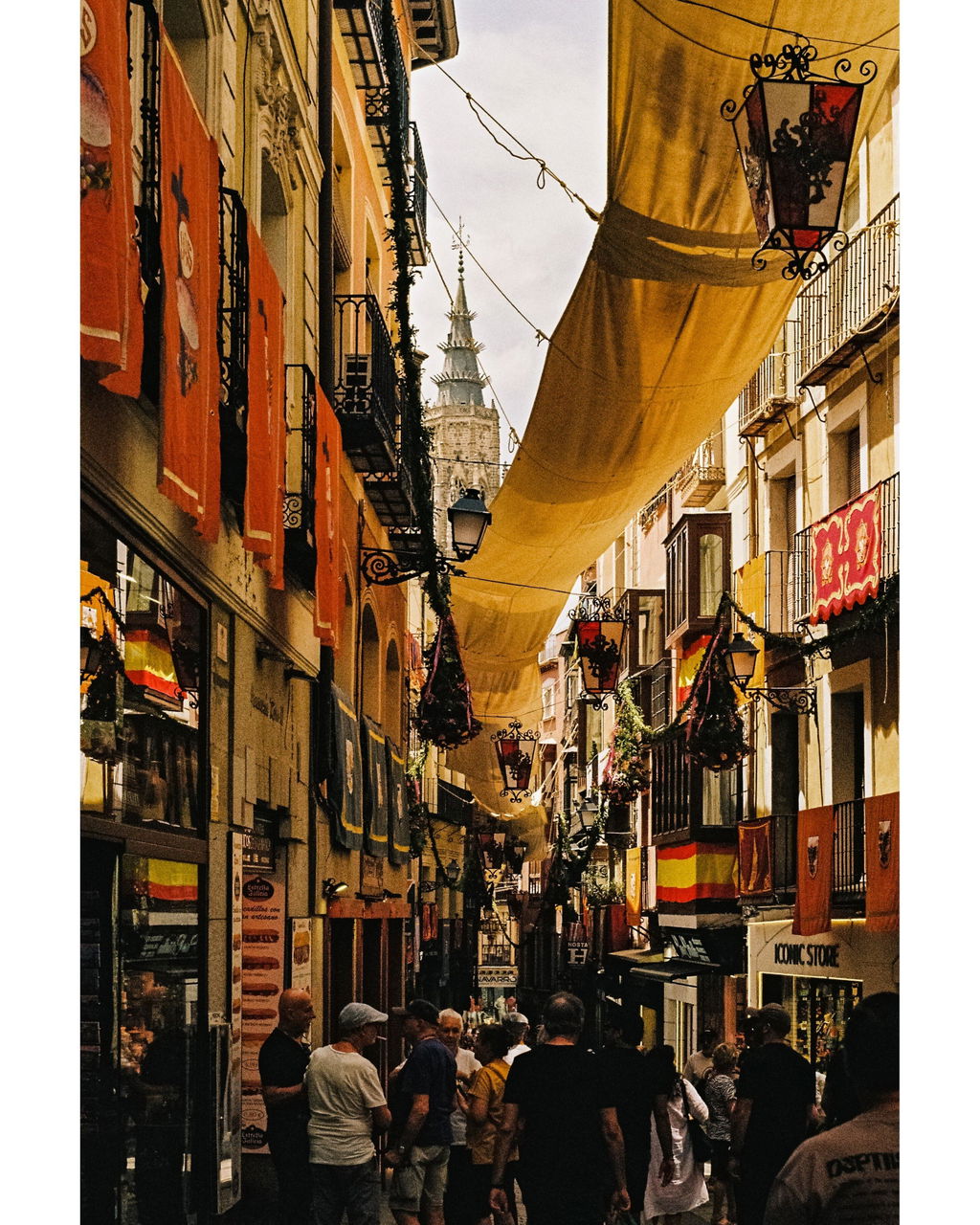
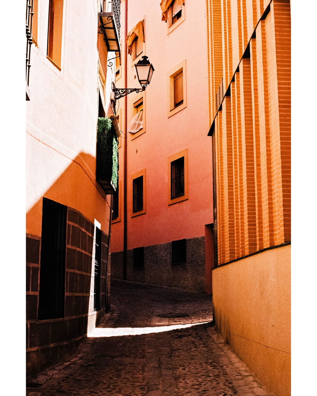
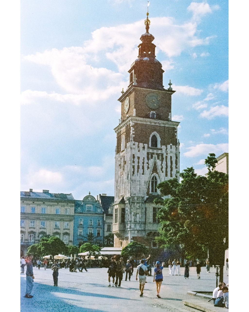
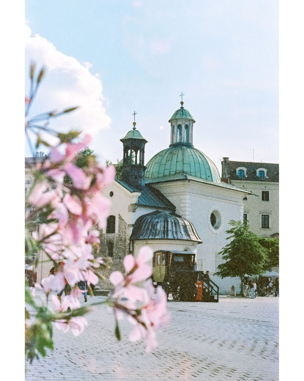
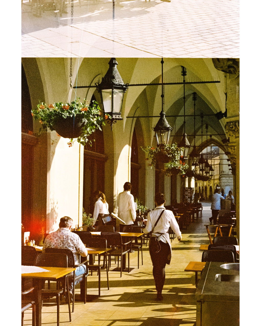
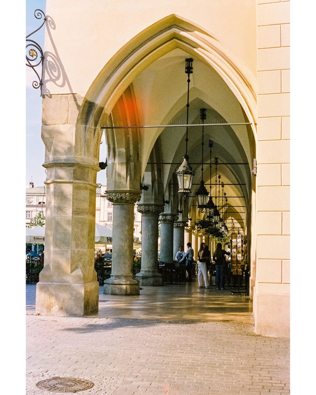
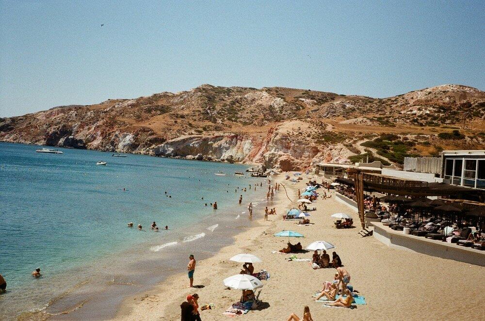
I shot Kodacolor 200 on a recent trip to Poland, with these photos taken in Zakopane. I rarely shoot colour, but I really enjoyed this film. It produces warm, vintage-looking colours with plenty of character, and I’d happily shoot it again.

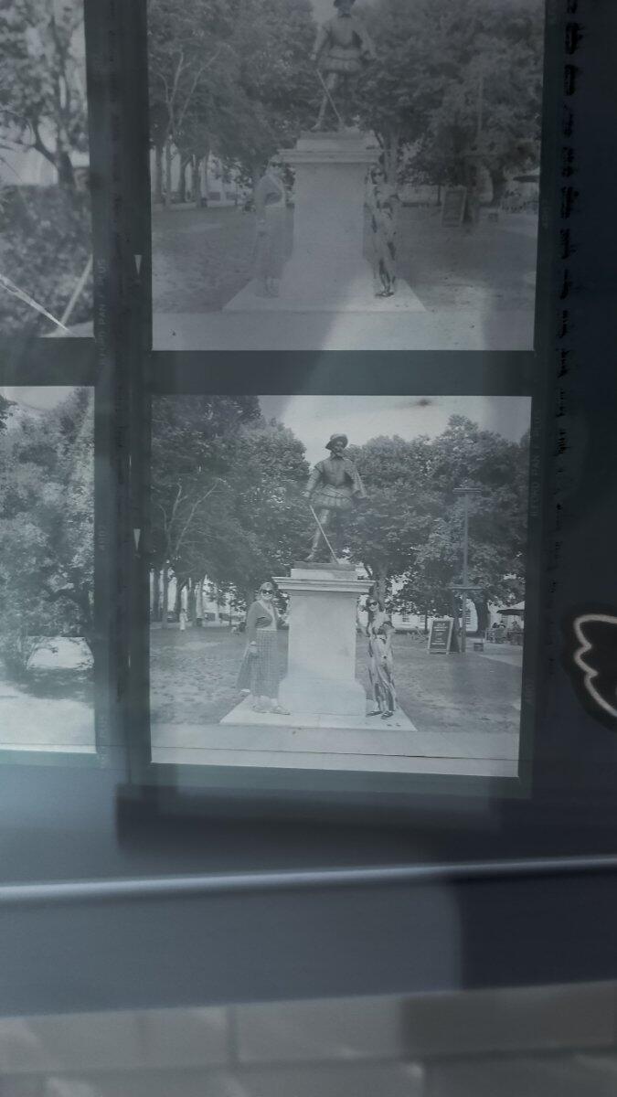
Six stars for the latest lot I've had back from the Wondies.
Great work.
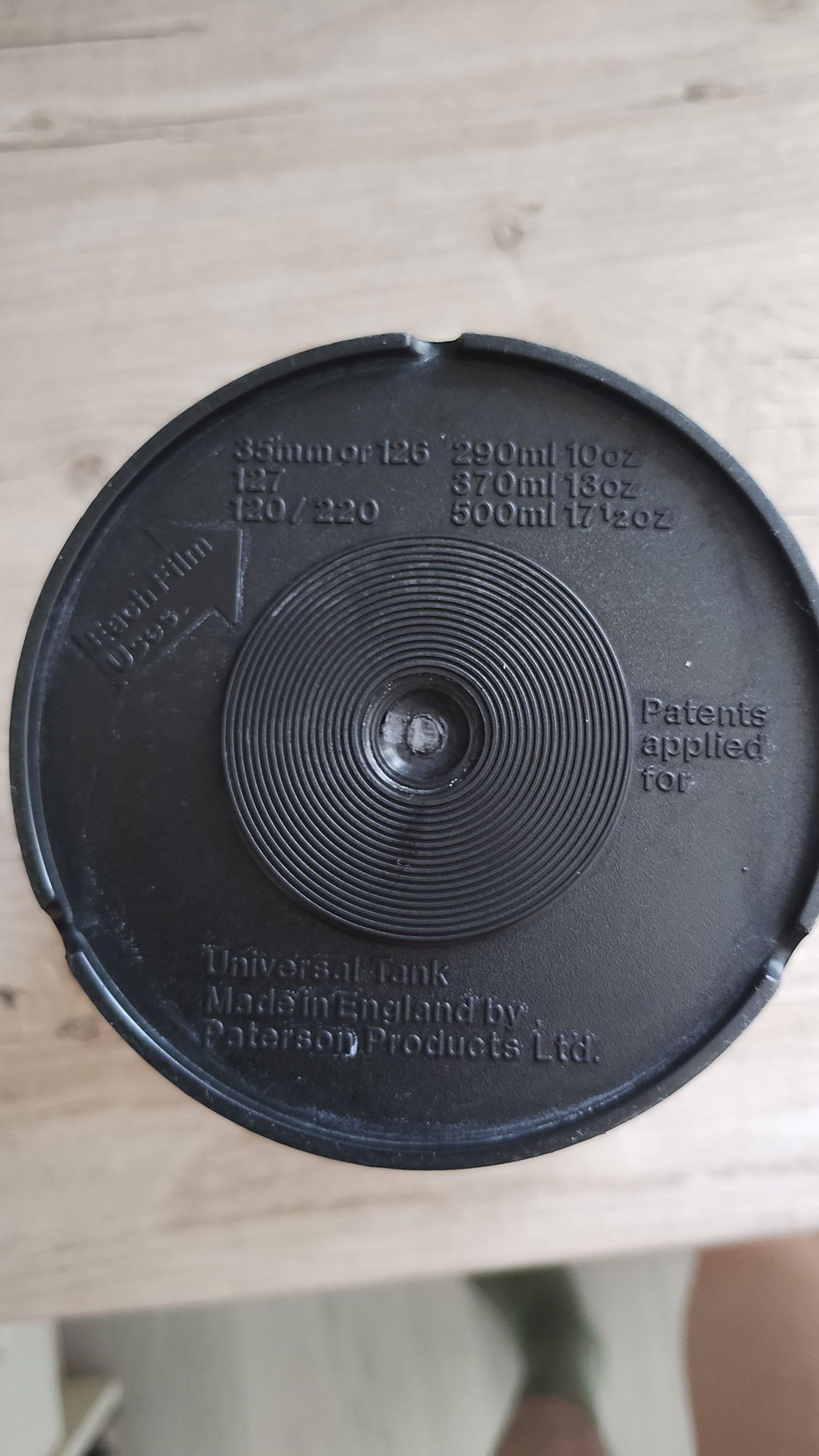
Economical, as it takes 500ml to cover a 120 film, rather than 600ml in a tank I was using before. Rather leaky though.
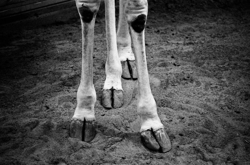
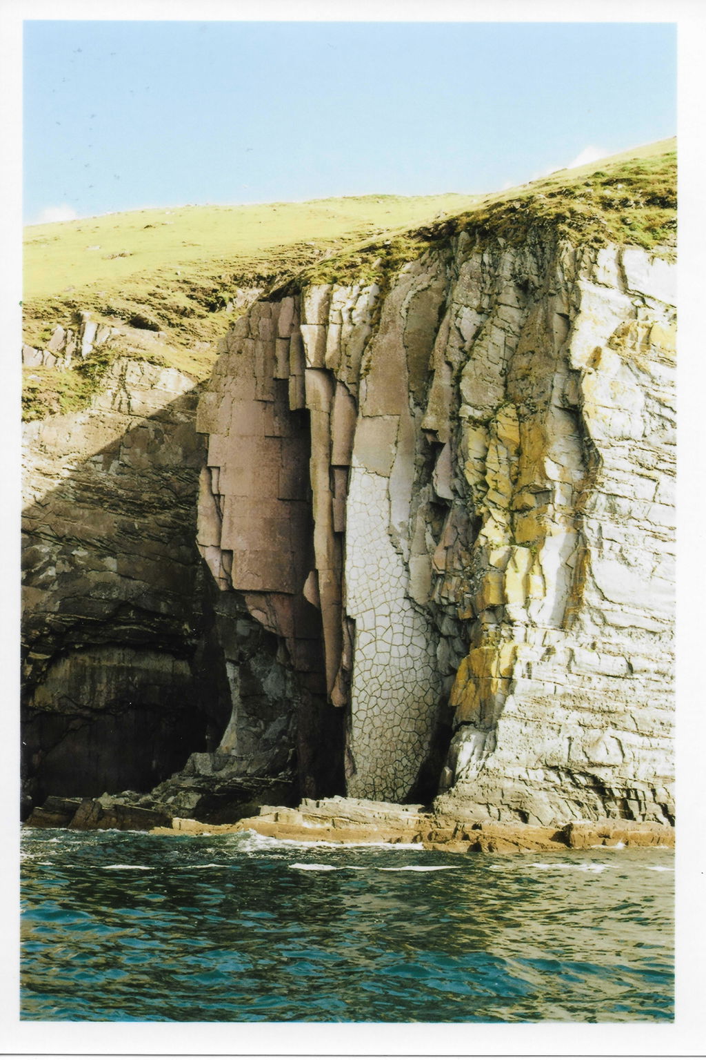
Pan F is wonderful for sunny days (and with careful use, slightly cloudy ones). The only drawbacks are a short latent image life and the fact that the highlights can get blown out very easily. A 20% reduction in development time when overexposing for shadow detail might work.
I keep coming back again and again to TMAX - it is now my absolute go-to black and white film. I feel really happy with the results in some quite awkward lighting conditions.


pretty good lo-fi results, a cheaper alternative to a full roll of 35mm. the cameras are super cheap to pick up these days.
It is a fast film but I used it on the brightest day imaginable! I think it was a bit much for my ancient Pentax ME but I got some good results.

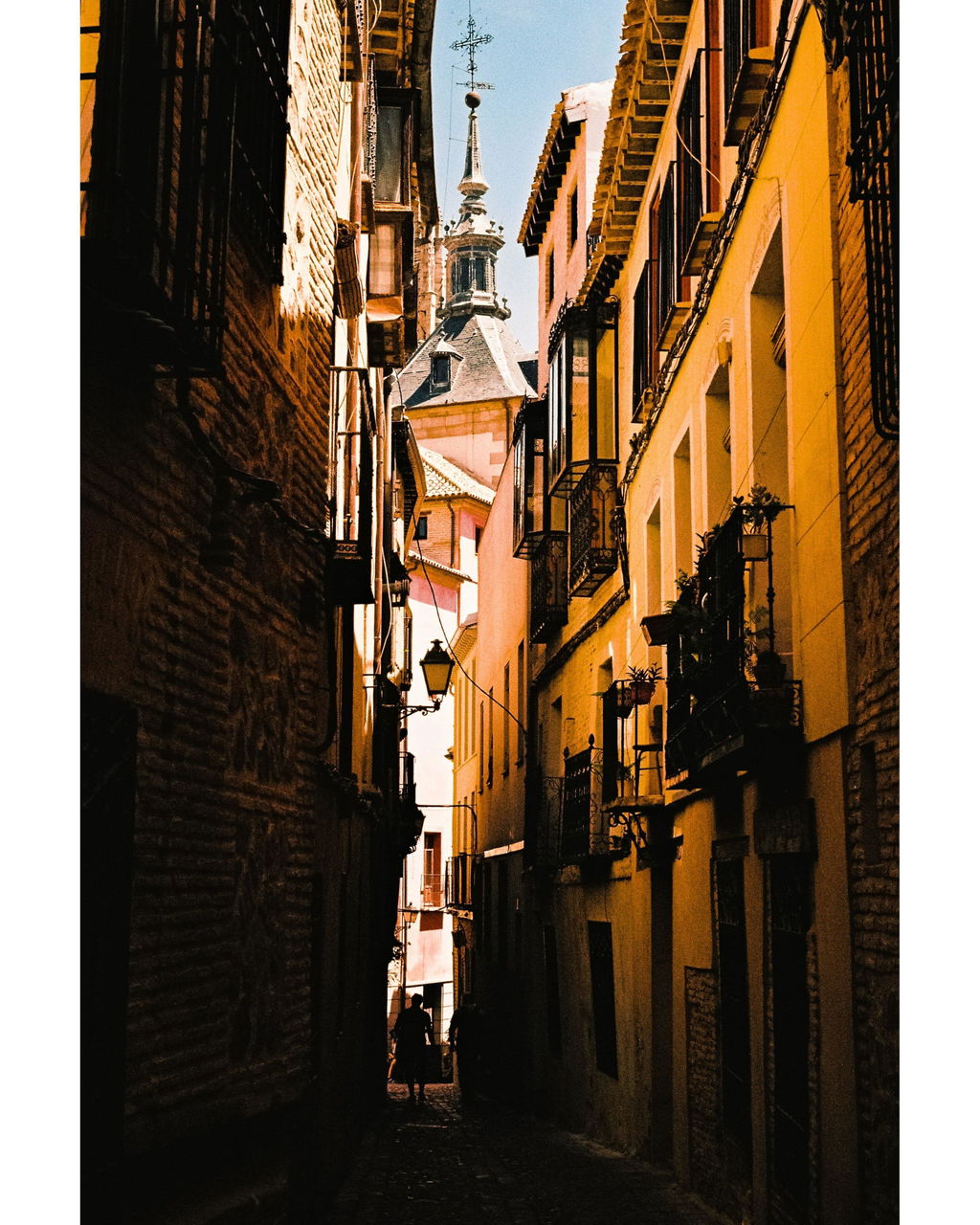
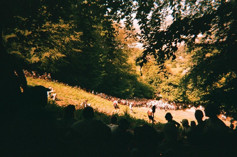
There is something profoundly poetic in Fomapan 100 Classic. I particularly appreciate the fact that in an era where majority legacy film brands have vanished Foma still manufactures this stock in Czechia. I believe the images it produces carry a raw, honest aesthetic that feels completely unchanged from the mid-to-late 20th century. For me it's perfect for evocative street photography.
This is replacing the C41 kit for me. It develops a better negative for scanning. Yes, you can develop any C41 film in ECN2. You'll get a richer & softer tonality, and overall highlight control.
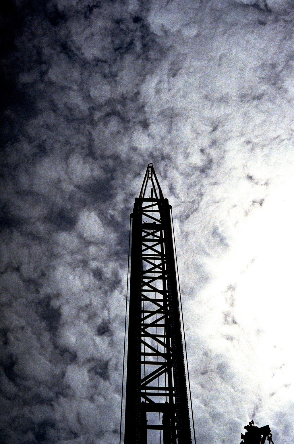
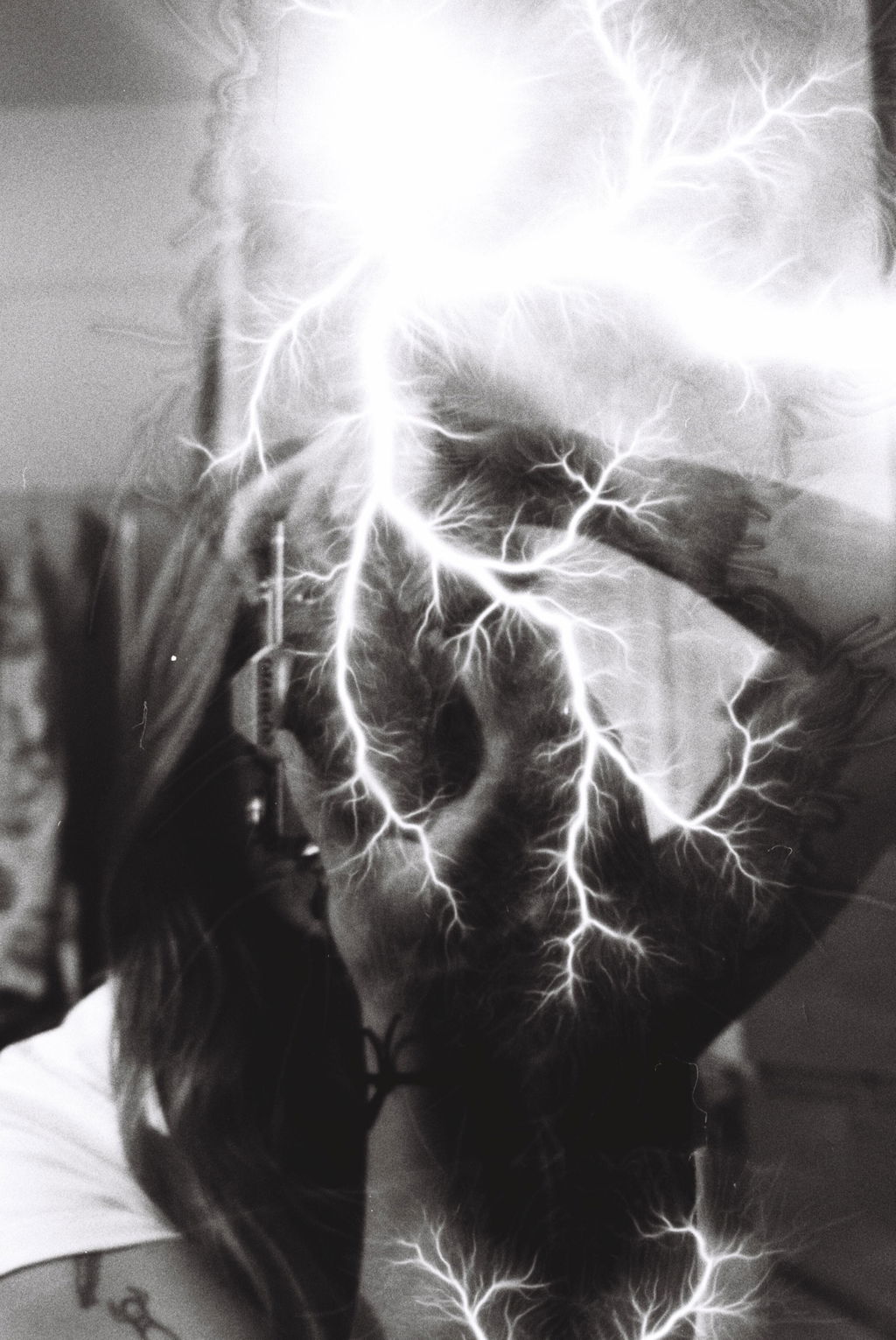
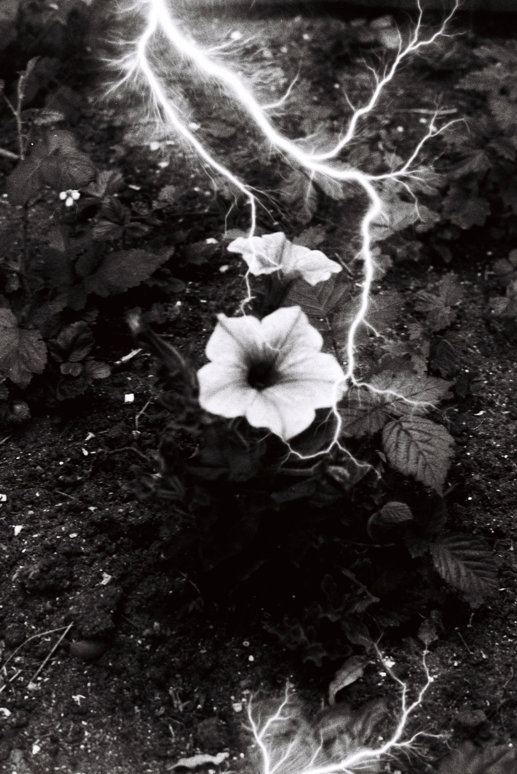
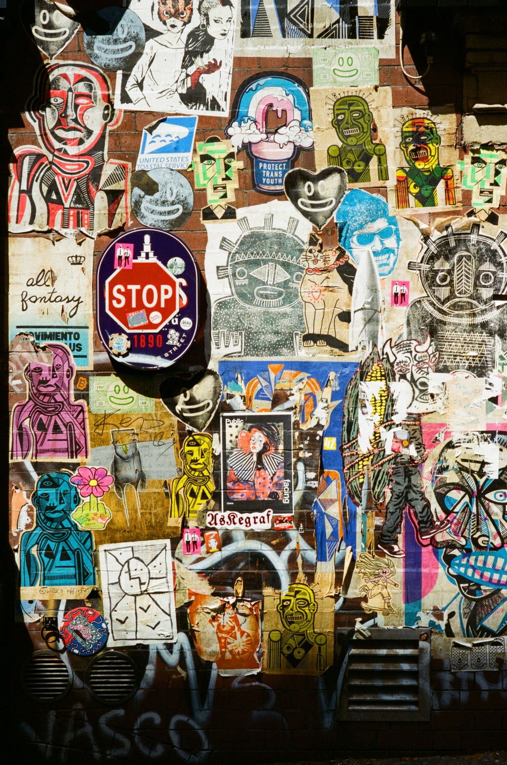
Absolutely love the effect on this film! Creates really dramatic pictures
I love HP5 so much. After spending a good amount of time shooting kentmere rolls the step up to HP5 is noticeable. I love it so much and it’s now my go-to film. Incredibly versatile. I normally shoot it at box speed, but I also love shooting at 1600. Recently trying pulling one stop to 200. A film that I can shoot and develop at home with 200-3600 iso range is just awesome.
Pretty solid little film. Does a job in most situations and is always consistent.
Can't really fault it for what it is. Not as "pro" or fancy as some of the more expensive films but in all honesty, how much does the casual photographer really need those?
Ultramax will get the job done.
Nice alternative to Cinestill.
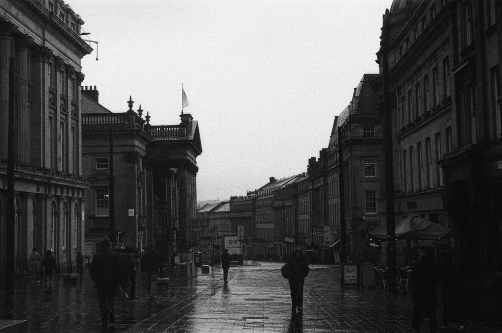
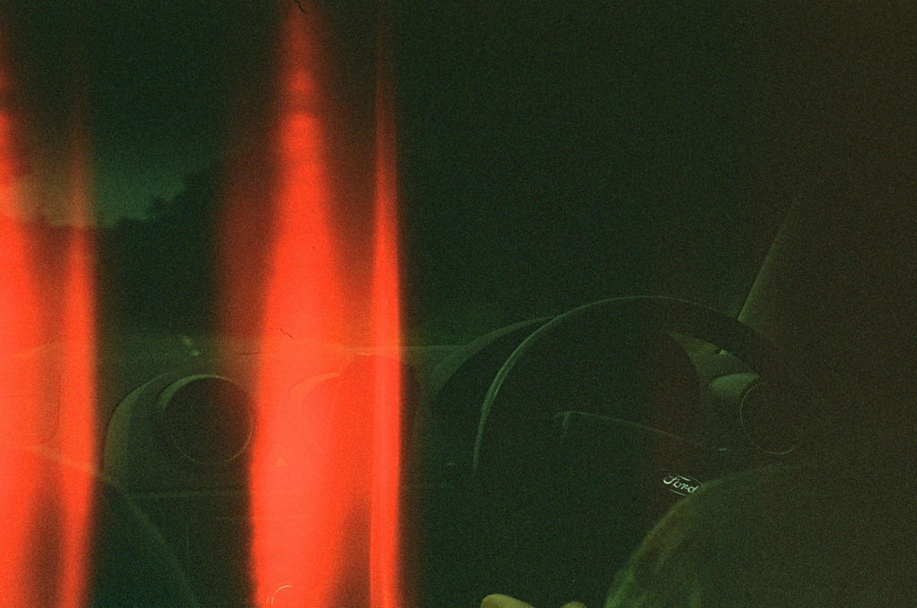
Good for low light/people who live in Scotland.
Can show a bit more grain than Kodak or Cinestill alternatives but is a good substitute if they are out of stock and is generally fun to use regardless.
Have used this a couple of times and have probably accidentally overexposed it more often than intended. Easily done but I put this down to my error rather than the films.
Nice to have a shorter roll of 800 iso film at 27 shots for shorter trips/shoots.
Great film with really strong vibrant colours, every shot was amazing
I bought this for my son for our recent holiday and he had a great time using it, he's currently on his 3rd roll and has bent taking it with him everywhere.

Rather liked this film, feels like a half way house between standard Kodak Gold and Lomography Metropolis
This was the first roll of film I ever used and I absolutely love the colours and accidental abstractness it gives some images. Unfortunately I ran into some camera issues during this shoot but I guess that means its time to buy another roll.

Lovely scans, clean as a whistle.
Great work as ever down at Wonderland.

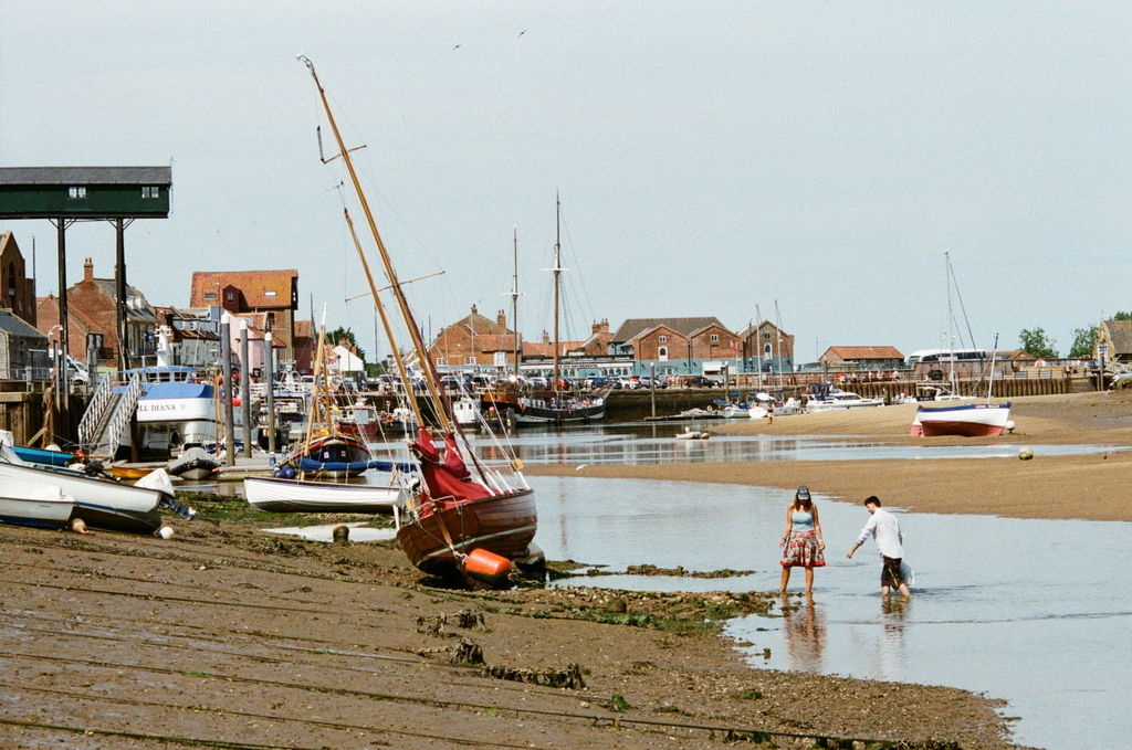
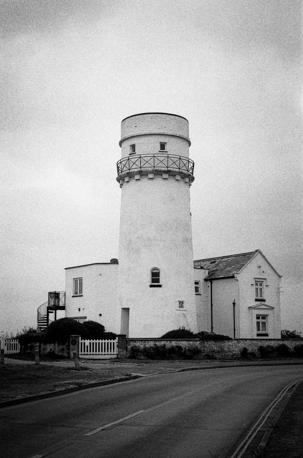
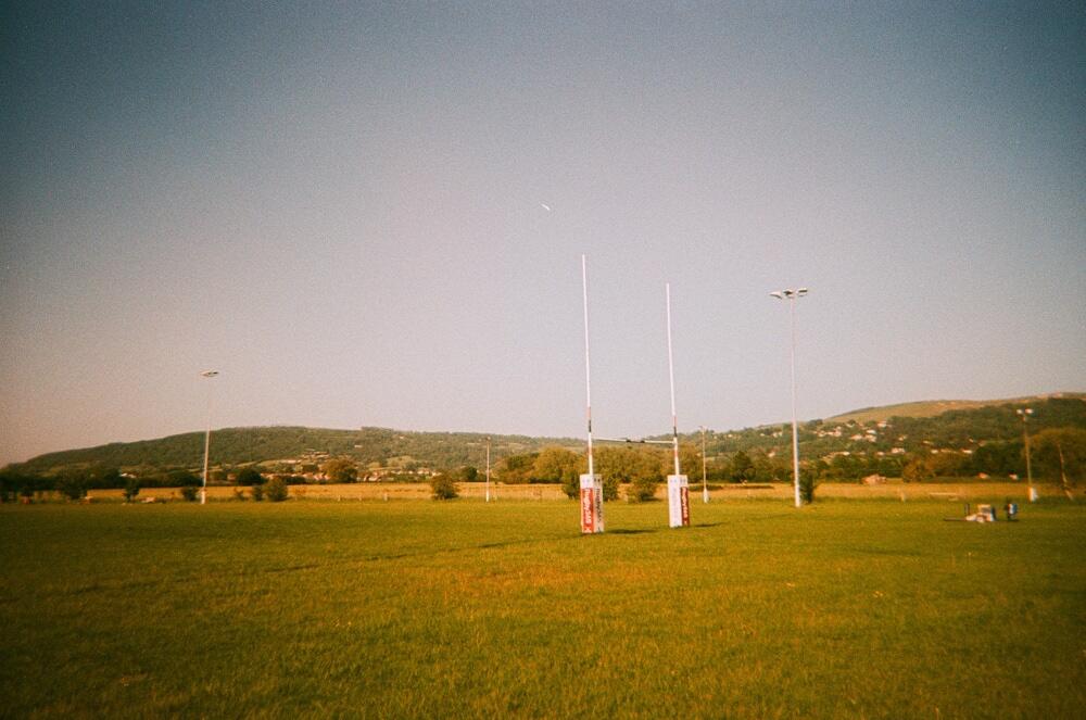
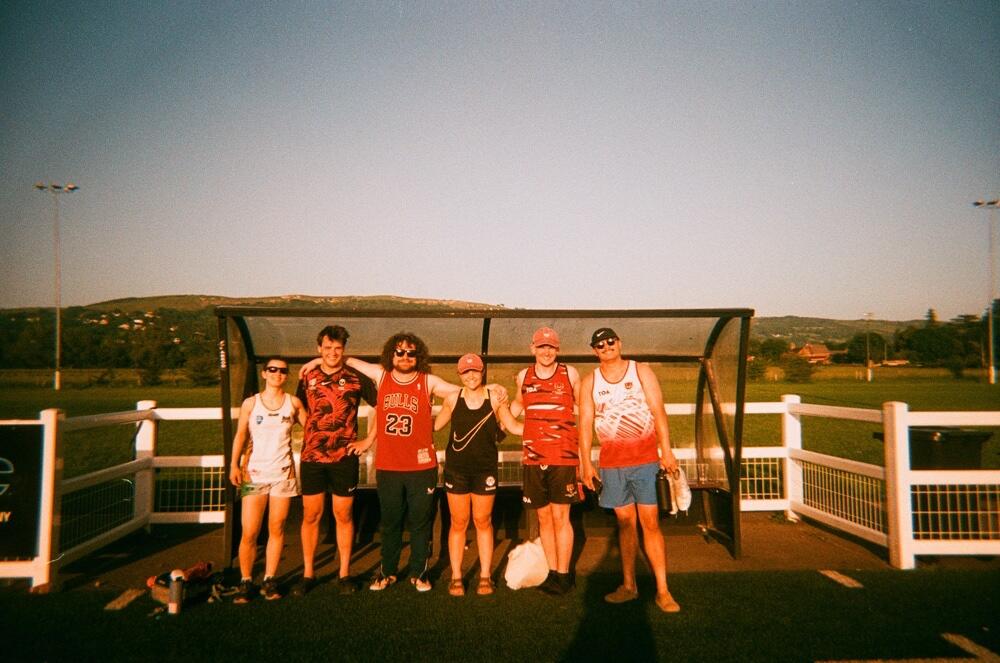
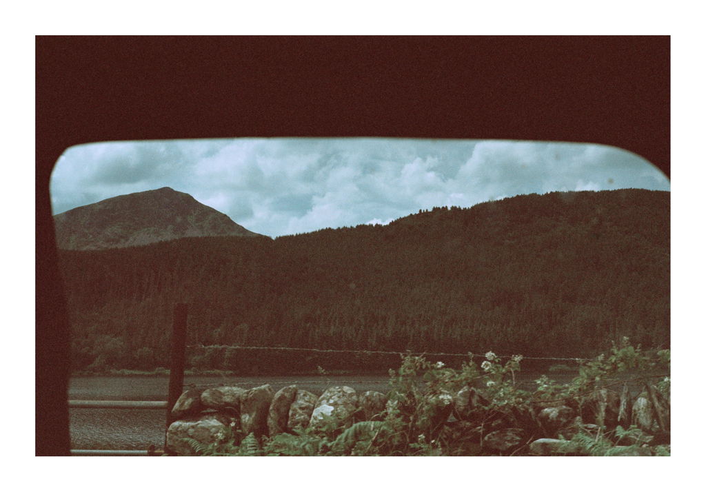
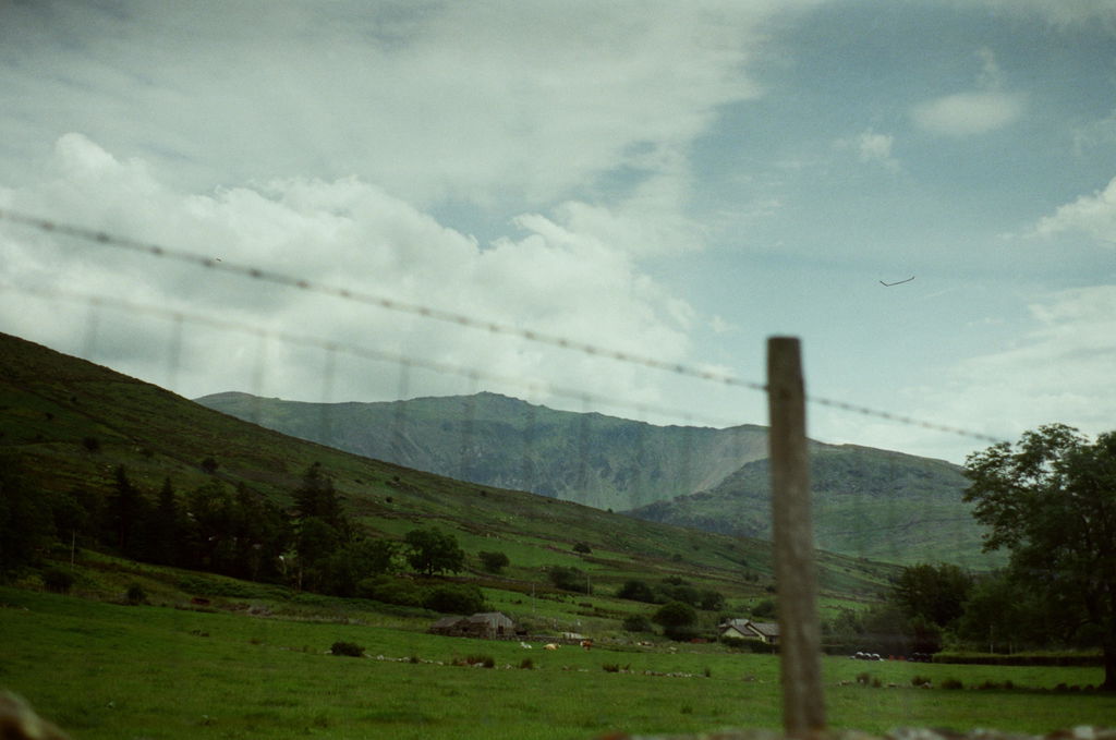
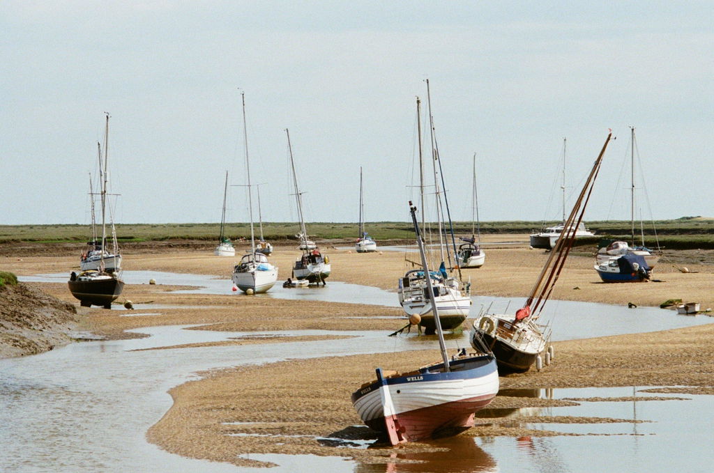
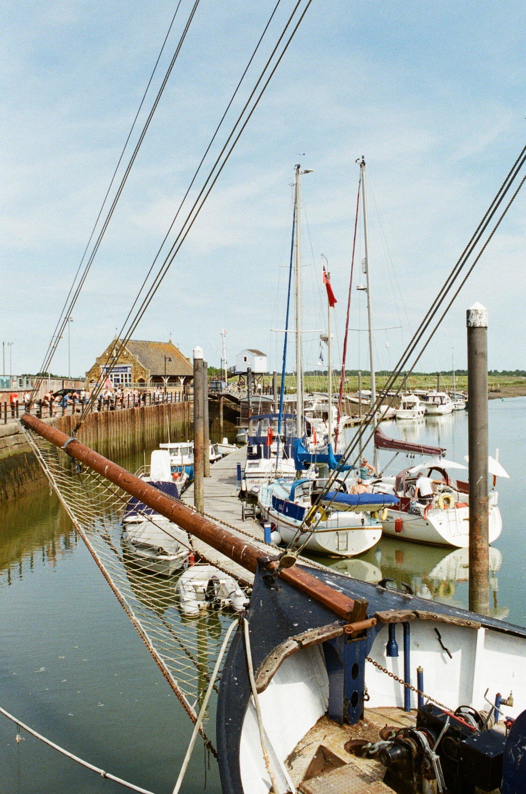
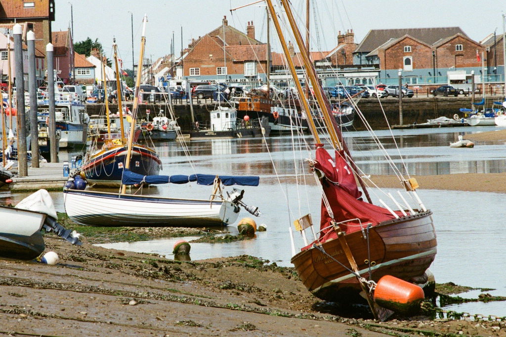
Ultramax was the chosen ammo for this year's AW photowalks and it was well on target for the Wells leg.
These are straight off the standard scans and the film produced some nice results.
Some might say colours could do with livening up a bit but better slightly flat than too saturated for me.
Nice and sharp for a 400 film and not too much grain.

This was a bit of a wow moment, I'm not used to 400 ISO colour film actually giving a nice result. Can't go wrong, dark/light/shaddow/backlit it just kills it!
Really is a fire and forget film. Well played Kodak, well played.

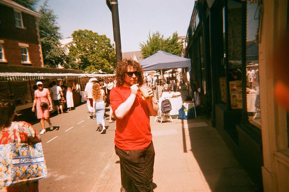
Kodak Gold 200 is an essential no matter what season or occasion. It is also a great price point for the quality it produces 📸🌟


This film works very well in harsh midday light.