Recent posts
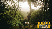


Rollei Ortho Film Review
Our Rollei Ortho film review combines the community's comments, recommendations, sample images and feedback to give you an excellent overview of Rollei Ortho 25 film's strengths and weaknesses!
Produced for Analogue WonderBox subscribers in June 2021 but a useful overview of anyone wanting to understand Orthochromatic photographic film!
Orthochromatic vs Panchromatic
Rollei Ortho is a black and white film with a very specific look, relating back to its name 'ortho' meaning orthochromatic. Orthochromatic simply put is a film that is sensitive to all visible light, except red. This means you can safely handle orthochromatic film under red light i.e. in your dark room! This feature makes it particularly useful for beginner film photographers, especially whilst practicing those tricky bits like loading a film spiral in the dark.
To understand what orthochromatic means in more detail, let's take a look back at our old friend the colour light spectrum. You may wonder why it is necessary to look at the colour light spectrum for a black and white film, but actually this is where a lot of the subtle differences between black and white emulsions come into play.
(c) thedarkroom.com
You may know that black and white film is dependent on Silver Halide crystals that are activated when light is shone upon them as you take your photos. 'Native' silver halide crystals are only activated by a small sliver of light, around blue and green on the colour spectrum. This means that they are not activated by any red light.
(c) Richard Orttewell
The History of Rollei Ortho 25 Technology
At the start of the 21st Century, Silver Halide was in use in all emulsions. The easiest way to see this today is in the earliest Hollywood films - skies are blown out as the film is very sensitive to blue relative to the rest of the scene, and skins can look very dark.
This was difficult to manage, directors would need to look through filters to try and work out how costumes and sets would be rendered on the film. Actors were using tons of strange make-up that didn’t look normal in real life but would replicate reasonable tones on film. It was a lot of hassle and took lots of planning!
In 1906 a German chemist worked out that you could add dyes to the Silver Halide crystals to extend its sensitivity across the spectrum, which gave birth to panchromatic films. This was adopted fairly quickly in the stills photography world but Hollywood held out for another couple of decades because the cost of this film was significantly higher.
Film and the Make-up industry
This development in film completely changed how make up artists had to work on the film sets. They went from trying to make skin tones look 'normal' on films that couldn't see red light, to more traditional now to making people look as good as they can under normal filming situations. One of the first make up artists of this era was a man called Max Factor and that was the start of the cosmetic brand, in the transition from orthochromatic to panchromatic movie shooting.
(c) Max Factor- The Max Factor Story
Skin tones under Orthochromatic film
When discussing skin tones and early Hollywood, it is important to recognise that it is caucasian skin tones that were considered during these scientific developments. Institutional racism unfortunately means that a lot of the images that we see, the sample photos and the research and development in the area, were aimed at making white skin tones appear more 'normal' under the camera, and the technology wasn't there for darker skin tones. Even today, of the sample photos we see, a lot of them are looking at what happens to white skin under different lighting situations.
We hope the Analogue Wonderland community can help us improve this, and bring us a more diverse range of skin tones so we can better our understanding of how darker skin tones react to orthochromatic film.
Orthochromatic vs panchromatic film photo comparison (c) thedarkroom.com
(c) @Thermo_metre
In Summary
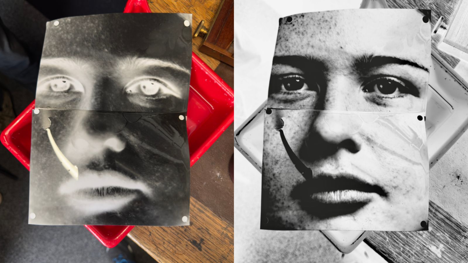
In summary reds are going to show up very dark, greens and blues are going to show up very light. This is because your camera meter is going to be panchromatic, it won't understand that you're trying to minimise the greens and blues in relations to the red. It will try and balance for everything, this isn't like using a filter. The camera won't take in to account that you're using an orthochromatic film, so the light meter will meter for normal and from that orthochromatic will not see the reds and will see more blues and greens.
For example, if you take a photo of a landscape with lots of blues and greens be careful not to over expose your shot. You will also notice when taking portraits of caucasian skin in particular, that the lips, eyes and areas that are quite red will look quite dark on orthochromatic film.
Contrast will tend to be higher, especially in scenes that have distinct red (will get noticeably darker) or distinct green (will be a lot brighter). Aside from all of the orthochromatic details, this film is a low ISO of 25 so your images will be of high detail, fine grain and great resolution- you will get incredibly sharp photos.
For full tech specs, more reviews, and community sample photos then head to the product pages as below:
If you enjoyed this Rollei Ortho review and found it informative then check out our other WonderBox film reviews here: https://analoguewonderland.co.uk/blogs/film-review
Ready to dive in?
Keep Reading
View all
Kodak Ultramax vs Kodak Gold: Which Film is Better?
Are you stuck between choosing Kodak Ultramax or Kodak Gold film for your next project? In this post, we dive into analyzing their differences and discovering which film is better suited for you.
A Massive Camera In The Middle of Stirling: What Could Go Wrong?
Al Dawes set up a Camera Obscura in the middle of Stirling to promote the photography festival - and celebrate the Big Film PhotoWalk, and captured stunning images!
- Opens in a new window.