Purple: Worked great with nature, shifting the greens into a lovely purple/pink. Far more subtle effect when shooting buildings.
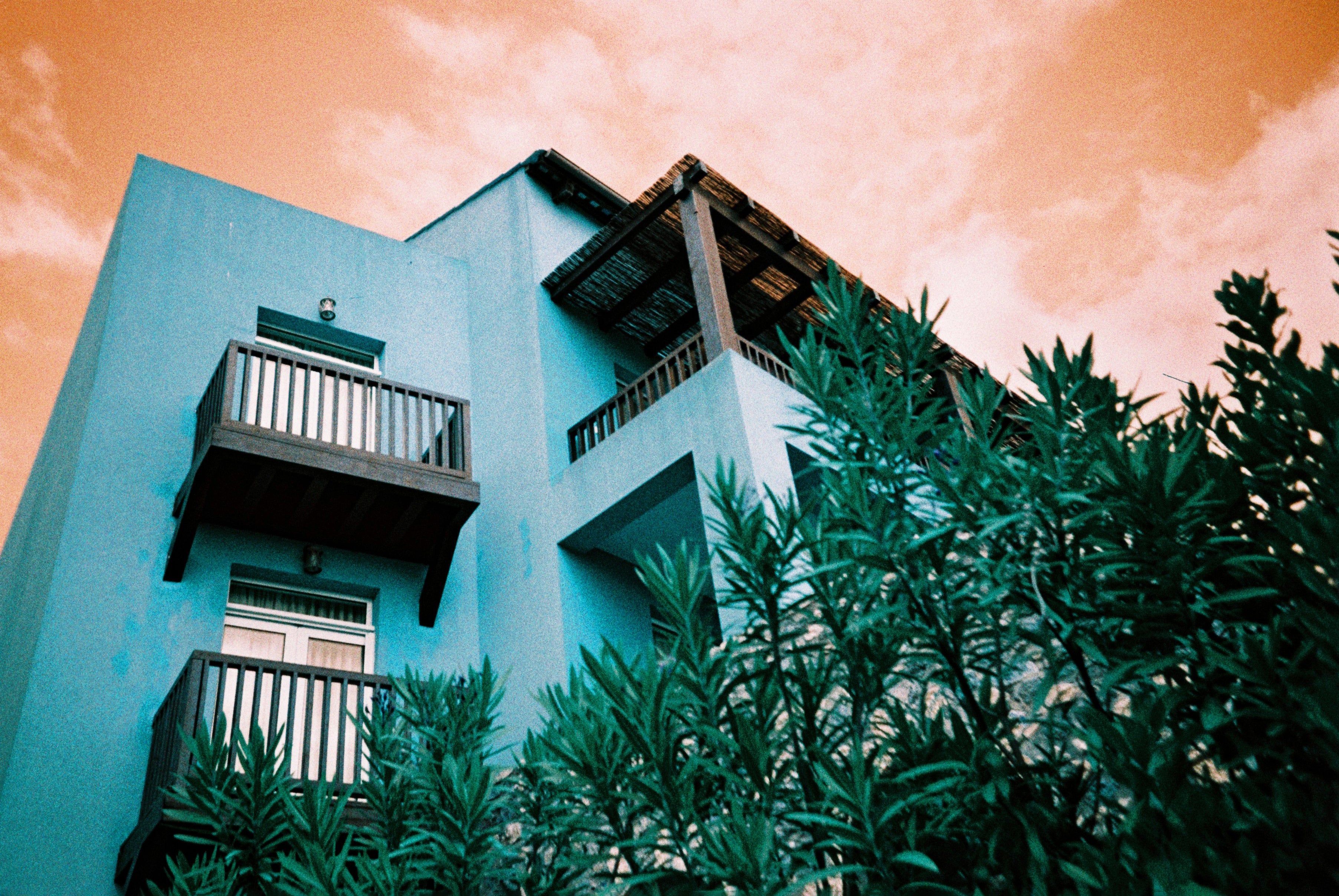
Turquoise:Portraits look a bit silly, does not work with skin tones very well at all (even as something obscure and "artsy"). It is however, amazing on scenes with a bright blue sunny sky, shifting it into a piercing orange. I got many shots in central London and worked great on a mix of building and sky.
Metrolpolis:Definitely the least "extreme" of the colours, where some shots look almost as if I shot them on cheaper kodak, on an overcast day. That being said, they look fantastic! I shot this roll on my point and shoot instead, which enhanced the aesthetic.
Summary: Well worth a go, even if you buy an individual colour to test the water! Hopefully breaking them down gives a better idea on what each is better for, along with the samples in my review. Purple was my favourite in the end, got so many amazing results in quite a few different, and varied, environments.

