Recent posts
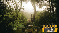


Shop the article
Ektar vs Portra: the Architecture Showdown
Written by Andrew Walmsley a.k.a. The Phlogger!
Deciding to compare Ektar and Portra was quite exciting, as I had never shot Ektar before but hard heard about its reputation. My idea involved writing a few articles comparing these 2 lovely films to capture different subject matter, like portraits, landscapes and architecture.
After speaking with the Analogue Wonderland team we decided to bring you an article about architecture for a change. Architecture has the requirement for detail, the leading lines, colour and an interesting building and may bring different ideas or reflections that more common scenarios. I have tried to capture these elements within my local area and provide the results united for your comparison.
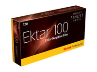
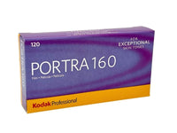
The Films
We are looking at Ektar 100 and Portra 160 from our friends Kodak Alaris. Personally, I have seen many people shoot both films for specific purposes - landscapes for Ektar and Portra for portraits - make sense so far? However, as I’ve progressed in film photography I started opening my mind to creativity, and mixing up the expected partnerships.
One of these films is more popular than the other, as Portra is known as the workhouse of the brand and capable of anything. It’s so robust it will capture in most genres and Kodak has a range of ISO’s to help you out (160, 400 and 800) and a reputation for being able to push this a number of stops.
For the technical minded there are normally 4 important pieces of information you consider for choosing the right film for your subject matter - contrast, sharpness, colour saturation and grain.
- Contrast = the strength at which the film shows the range of light to dark
- Sharpness = the amount of detail that the film can show
- Saturation = the 'vividness' of the colours. Low saturation makes for a more subtle image
- Grain = the size and presence of the spots in the photo that give film its unique look!
Kodak provides simple guides to its range of colour film and suggests the following typical results (remember that different lighting, camera and lens set-up can affect all four of the attributes)


So Ektar is far contrasty, sharper and the grain and saturation are far superior to Portra. It’s a useful guide to use when deciding to shoot architecture.
Prices are usually around the same - although availability has been a bit up-and-down this year so when you see good amounts of either I'd recommend stocking up!
The Plan
The idea behind the work was to shoot a number of times using each film where possible to provide a distinct comparison. Well, you know what they say about the best-laid plans of mice and men! Opportunity and time are not always possible in my life, so I have to settle for what I can. It may have been more prevalent to shoot both films at the same time, but that is beyond my scope (don’t have 2 backs). It’s a sensible decision to shoot close to home as it provides you with the benefit of returning if something goes wrong.
They represent 3 different types of architecture in essence, which are modernism, classic and abandoned. Every shot in the collection has been taken with my trusty medium format Bronica ETRS. Most of the shots were taken during good light which allowed me to handhold. Please remember this camera is fully manual with no meter, so I’ve had to rely on my eyes. Any mistakes in exposures are purely my own and not related to any bad development/scanning. For the sake of consistency each film was developed and scanned by the same lab.
This idea hit me one night, why don’t I shoot this architecture stuff on a different lens length and ignore the people set on rules. You don’t need to shoot wide-angle, it’s all about composition and intent. I decided to shoot a lot of these using a 150mm lens to provide a constraint in the shooting, just to add to the fun.
The Photographs
For this one I was walking around the small town of Gainsborough and wanted to use the new modern feel and look of supermarkets. Portra 160 was loaded on this occasion and you can see there is a fine exposure and the yellow of the warning bollard is not vivid enough to be Ektar.

During the same walk to Gainsborough, I managed to find an abandoned public house. Again its the Portra 160 being used and you can see a good exposure with the blue cloud coming through, but the tones are muted.

This next shot was actually taken while on holiday (yes i took the large Bronica with me!) and features the amazing Blickling Hall Estate in Norfolk. My eldest daughter and myself went on a bike ride here, so I managed to fire off a quick shot. You can see its a magical place, a National Trust residence that’s always busy, so taking a picture with no people in the frame would be hard.
From a technical perspective the weather was perfect, maybe a few too many white clouds, but the Ektar handled the exposure really well. It is so true what everyone says about the emulsion, it definitely produces are warmer tint, so looks red. If you look back at the house it’s quite evident here compared to the bricks on the previous image of the pub.

In this shot we move across to a recent walk around Newark, the aim of this was modern housing which I see so popular on Instagram. In this one we again see slightly less saturation of Portra which is even worse in lower light - this was taken towards the evening.

A lot of people don’t like this modern architecture due to boring lines and repetition, a vast lump of concrete. But to architecture photographers it’s everything you can ask for.
The hardest part is the choice of angle and framing, something that can drive you crazy. But as a film photographer, you have to be patient and not rush your frames. You walk the scene, look at what’s available and check the position of the sun. Again with a cloudy day, you can see much less saturation in the colours.

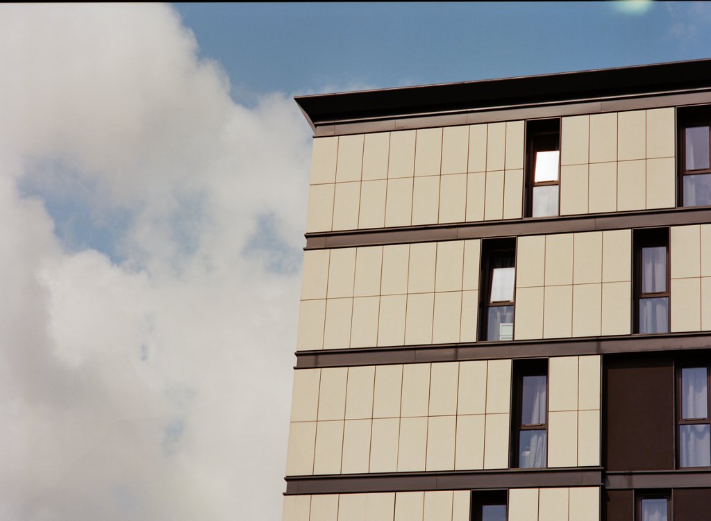
This next one is one of my personal favourites as I’ve tried to position only part of the hotel in the frame. With great light on this day, the Ektar has shown some lovely detail, saturation and if you look at the top window there is contrast in the whites. This was one of the few shots where I used a tripod, as I wanted to take my time.

As you can see on the below image, after trying this on Portra 160 the colours are a little muted. Unfortunately it was not possible to use the same lighting conditions, as the images were taken months apart. Hopefully this gives you an idea of what is different with Ektar, you may notice its sharper too.

The next building draws many people’s attention for its location on a busy roundabout in Lincoln. However, you only notice the curvature of this design closer up on foot and it looks like its split halfway up. This provides something else to focus your attention away, so you have both black and white contradictions in the lines of the window frames.
One technical problem with architecture is lines, because lenses naturally cant cope with straight lines - many top professionals use tilt-shift to correct this. But on this particular building the whole building is curved and the simple blue and white are contrasted with the blue sky. Again the Ektar showing some great detail in the window frames and such a favourite I had to include two pictures!


This shot is from the university campus too, part of their science park. It’s not a natural shot you would see from walking past, you only notice this pattern at a certain angle.
Again shooting at 150mm always this very different viewpoint, where you can only shoot smaller focal points. The Ektar film handled this so well and brought out the deep colour of the wood panneling, but managed to make it slightly redder, which works really well.

Whereas if you look at the tone in the below image shot on Portra you will notice a slight difference - it feels more gray, but the Ektar looks a deeper coloured wood. There was a marginal difference in light as the sky was more overcast than blue but you can see my point.

Conclusion
I am very proud of this work, it’s taken me a few visits to choose the right weather for these and hopefully, you will enjoy the results. As a resident of this small city I’m proud to show you Lincoln with a tint of modernism.
I don’t ever pretend to be a technical person and this article was never intended for that. My hope is it it renders you with an idea on the capability of 2 different films. Ektar loves the light so shoot carefully. Portra has been my go-to film since I took up analogue photograhy but I’m actually thinking of shooting Ektar more. I mean even if the saturation is too much, you can always edit it down, which is better for your images than adding saturation afterwards.
If you look at Kodak’s documentation it’s quite interesting that Ektar is so saturated, then next is 800 ISO Portra, but Portra 160 is the worse!
After completing and takes many of these shots, it provided me with further ideas for projects. You will see these projects in the future on my website - phlogger.co.uk
Hopefully, you enjoyed reading this article, if you haven’t tried Ektar, buy some now and try it. Please consider setting yourself a constraint like shooting different focal lengths, you never know what you might achieve and learn. I've shot above in 120 throughout, but of course both Portra and Ektar are also available in 35mm.
All photos in this article (c) Andrew Walmsley
Why not check out some other articles comparing and reviewing films for different situations as part of our 'Best Film...' Series
Ready to dive in?
Keep Reading
View all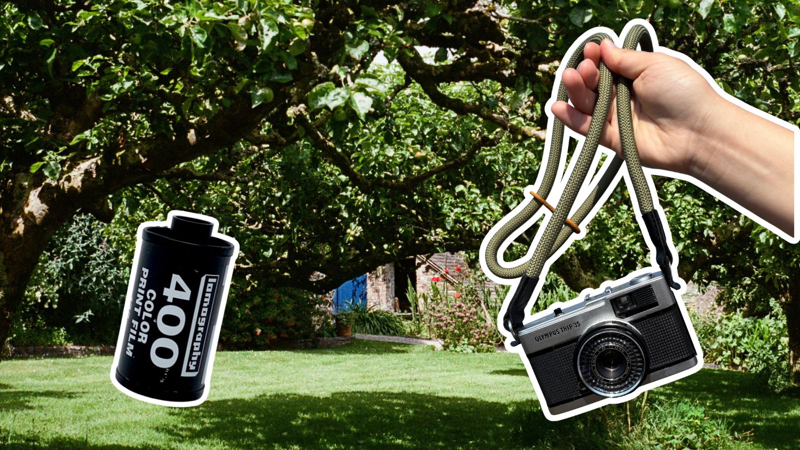
Lomo 400 And A Village In The Hills
Masha set out with a roll of Lomography film, her Olympus Trip 35 camera, and the specific goal of capturing gorgeous photos of an English seaside village.
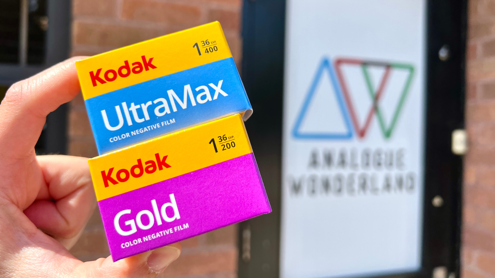
Kodak Ultramax vs Kodak Gold: Which Film is Better?
Are you stuck between choosing Kodak Ultramax or Kodak Gold film for your next project? In this post, we dive into analyzing their differences and discovering which film is better suited for you.
- Opens in a new window.
2 Comments -
Larry • -
Peter •
Excellent photos. Problem is in a comparison you need more back to back. So the same image replicated with 2nd identical lens and camera minutes apart. P vs Ektar real time)Then it’s oranges with oranges scenario. We know portra 160 is a dog. P400 vs Extar 100 the emulsion with the finest grain because I like big prints and architecture fan. Enjoyed your work…
This is fantastic, thanks! On those charts, I was shocked to see that Portra 400 is listed as sharper than Portra 160. Kinda blows my mind!