
Recent posts


Shop the article
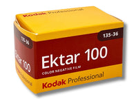


Kodak Ektar vs Pro Image - the Battle of ISO 100 Film
Many of us have shot a range of Kodak colour films, and maybe developed (😜) a preference based on the results. But how many of us have made a direct comparison by shooting films side-by-side? Especially the low-light specialists Kodak Ektar and Kodak Pro Image! Fortunately Masha has kindly done just this for us, let's see what she found...
Two films, one country
I am going to be honest with you that I am a creature of habit, and most of the time will reach for the same three rolls of film when going out with my camera, which all happen to be ISO 400. I enjoy having a little more flexibility and not obsessing over the weather as much. This means that some film gets left behind, forgotten and unwanted in my Tupperware container in the fridge (ISO 100 film I am looking at you), as I am under the opinion that if I am going to try those, the weather has to be spectacular without a single cloud in the sky. Well during my recent trip to Luxembourg, the weather was exceptionally welcoming, so what better time to load not one but two ISO 100 films, namely Ektar 100 and Pro Image 100, and compare them? Both films were developed by Analogue Wonderland (of course) whose technicians ensure accurate colour balance by emulsion, so please note that other labs may vary if they use images straight from the scanners!
What made this comparison much more fun, but also in some respect more fair, is that the cameras chosen for the film comparison job (Olympus Trip and Pentax 17) had fairly similar limitations when it came to exposure decisions. With Trip I was mostly thinking about focus, and whilst Pentax 17 gave me just a little more choice with additional possibility of selecting a shooting mode, a lot was still in the hands of the cameras alone. This meant that the film stocks had fairly equal ground to perform on, allowing for a truly fair comparison without also considering the drastic impact a camera could have. However, I do feel that it is important to note that Pentax and Olympus do have their own differences in lenses, metering and format (one being half frame), so there of course will be some subtle differences that are purely based on the camera rather than the loaded film.
Now that we are past all the necessary disclosures, I loaded up my Pentax 17 with Ektar 100, and my Olympus Trip with Pro Image 100 respectively, and headed outside (on several occasions). The hardest part was to actually stay in the same spot in an attempt to capture the same angles, subjects and compositions for the sake of a fair comparison, meaning when you put the two images side by side, you can truly see what has actually changed between Ektar and Pro Image.

Our intrepid Analogue Adventurer in action!
Old stones and textures
When you think of cities, I don’t think you often imagine valleys cleaving them in two. Well, Luxembourg is not a usual city, which means that it does in fact have its own two valleys running through it.
This was actually one of my favourite areas for walking (and running) in Luxembourg, so capturing it on film was a no-brainer. If you follow the Alzette river upstream, you will soon reach the fortress walls and Bock Casemates, once subterranean defence fortifications and no, somewhat more peacefully a tunnel system and well-known tourist attraction. Nestled against these walls is one of the best photo spots you can find in the city. However this time, it is not just my assessment, as the spot has clearly captured so many hearts that it is actually named “Best” on Google Maps too!
With so much old stone, towering cream walls, lush greenery and dark rushing water packed into one relatively small area, it was a perfect place to start my film comparison! Unlike the brighter colours of vintage cars (more on this later), I really enjoyed seeing how the differences would come out in more subtle ways through the difference in texture and shadows.

Ektar 100 through Pentax 17 (left) and Pro Image 100 through Olympus Trip 35 (right)
You can immediately see how much richer the Ektar colours are when placed alongside the more muted shades of Pro Image – I personally see myself as a visual learner, so I can read however much I want about the ‘ultra-saturated colours’ of Ektar 100, but until I see them for myself, I don’t think I can fully appreciate what that actually means.
Whilst this gives the Ektar image noticeably more contrast, I found myself leaning towards the Pro Image version a little more instead, as it seemed to preserve the softness of the stone and masonry a little more closely. However, what really stood out to me was how differently the river was rendered in the two images. Being fairly dark as it is thanks to the rocks beneath the surface, it was interesting to see how differently this translated onto film.
The Pro Image gave a much more natural-looking interpretation of the water, but in doing so surprisingly lost some of the bridge’s reflection on the surface. Ektar, on the other hand, preserved a much clearer reflection, whilst introducing noticeably redder undertones to the water. I found the difference particularly interesting as neither image felt quite like how I remembered the river looking in person!

Ektar 100 through Pentax 17 (left) and Pro Image 100 through Olympus Trip 35 (right)
However, whilst I did prefer the Pro Image interpretation of the “Best” spot in Luxembourg, I found that sometimes the additional contrast Ektar brought was actually beneficial too. For example, after you pass the bridge and climb the turret-like staircase, you emerge opposite a small stone building surrounded by a perfectly kept garden (which appears to be perfectly kept in all seasons, as I have essentially the same photo from December and the garden is identical!).
Here, I found the Pro Image rendering a little flat for my liking. Its softness and creaminess which worked so well in the previous photo, actually seemed to work against this scene and whilst it did preserve a little more detail in the shadows (something I noticed Ektar struggles with sometimes), I think on this occasion it came at the expense of some depth and separation that was needed in the image.
In contrast Ektar’s much punchier contrast gave the little building more definition and helped it stand out against the lush foliage and the fortress walls. I think for me it was actually quite interesting that the characteristics of Pro Image that I really liked in one photo weren’t actually what I wanted in another, as often I find myself just favouring one roll in general, rather than how it captured a specific location or scene.

Ektar 100 through Pentax 17 (left) and Pro Image 100 through Olympus Trip 35 (right)
Since this section is turning out to be a guided walk through the Alzette valley, it seems only fair to introduce you to Melusine as well, who is the mythical mermaid-like wife sitting beside the river that she vanished into once her husband (founder of Luxembourg) discovered her fishtail. Ektar did a fantastic job preserving the colour of the 3D sculpture as it appeared to the naked eye, but I think Pro Image gave the photograph a much more atmospheric quality, with the sunlight filtering through the leaves and the soft willow branches. Rather than simply reproducing the colours and sharpness of the sculpture, I really enjoyed how Pro Image made the scene feel a little more dreamlike, with the gentle light seemingly softening the statue’s sharp edges.

Ektar 100 through Pentax 17 (left) and Pro Image 100 through Olympus Trip 35 (right)
With over 70 castles and castle ruins packed into a country that is less than 2600 sq km, I think it would be a disservice not to stop at least briefly at one before jumping a few centuries forward to some of the more modern subjects from the trip. And what better way to do that then to look at the wall (or more accurately, the well-preserved remains of the walls) of Beaufort Castle. Whilst you can see some of the more recent residential chateau additions (can we call the Renaissance period recent?), what primarily caught my eye was how differently the two films translated, what is, at first glance, essentially the same wall.

Ektar 100 through Pentax 17 (left) and Pro Image 100 through Olympus Trip 35 (right)
It was interesting to see how much more pronounced the texture was with the Ektar photo, with the different shades of weathered stoned much more strongly contrasted against one another. This brought out considerably more detail than the Pro Image version, making the wall appear much rougher compared to the softer Pro Image rendition. It was also noticeable how much more prominently the shadows were captured by Ektar, making the photo feel much cooler.
The yellow undertones of the stone were also shifted towards much stronger reds and oranges, which technically should make the image feel warmer, but with the darker green and blue shades being also pulled out by the film, the photo still retained the distinctly cooler feel (which was a very stark contrast to the 30-degree day this was captured on).
However, the shift towards redder and more orange tones wasn’t entirely unexpected, as I have read in the past that Ektar can push lighter skin tones towards pink, so I wondered whether there will be a similar logic applied to light, earthy tones of inanimate objects too.
Vintage cars, colours and contrasts
A vintage car exhibition is probably one of the best places to bring a camera (or three in my case), especially when the aim is to see the differences between rolls of film and how they render the same subjects (namely cars). With so many bold colours, shiny chrome and reflective metal, the characteristics of the two films became much more apparent than they had been among the earthy tones of stone building and castle ruins. Spanning across what felt like half of the town, the exhibition offered so much for each film to interpret in its own way, whether it was the contrast between the classic cars and the added decor or even simply just the intensity of the colours and reflective surfaces.

Ektar 100 through Pentax 17 (left) and Pro Image 100 through Olympus Trip 35 (right)
I think for me personally, where Pro Image really shone was in making the photos feel more nostalgic and somehow more ‘fitting’ for the event, particularly when the cars themselves were a little more vintage, with the softer tones of Pro Image seemingly complementing them naturally. As you strolled through the event, you would often come across more classic and historical vehicles, with even an elegance competition taking place throughout the day.
Whilst Ektar made the colours much more saturated, which worked for slightly more modern cars or decorations, at times it felt a little too exaggerated and also too vivid for the older exhibits. Instead, the softness of Pro Image made the buffed surfaces of the cars feel even more reflective, working particularly well with the dappled sunlight streaming through the surrounding foliage. I think by softening the colours, it actually made it feel as if we had been transported back into the cars’ own time, rather than simply photographing a car on display in 2026.

Ektar 100 through Pentax 17 (left) and Pro Image 100 through Olympus Trip 35 (right)
However, whilst Pro Image worked super well with cars that comfortably fit within the ‘classic’ umbrella, I think Ektar was much more fitting when it came to contrasting paintwork, especially when cars were parked side-by-side. I really enjoyed how it brought out more vividness in the bright colours, making the cars stand out against their surroundings, as well as retaining the reflections across the painted surfaces, whereas Pro Image softened them slightly, making the reflections feel more blurred and muted.
What I found especially interesting was that while Ektar excelled at bringing out the detail in brighter-colours cars, it sometimes struggled to retain quite as much detail in the darker ones. Some of the lines, textures and little details (I unfortunately don’t have the ‘car speak’ to get any more specific than that) became noticeably less pronounced. Funnily enough this actually became truly noticeably only after I put the two photographs side-by-side.

Ektar 100 through Pentax 17 (top) and Pro Image 100 through Olympus Trip 35 (bottom)
Nature, vineyards and the lake
If you’ve read at least one of my previous blogs, you already know that I have a weakness for anything involving nature, landscapes and frankly, the colour green in general. So naturally, having at least a few photographs capturing this particular weakness was a given. I was also curious to see how both films would perform when faced with large areas of relatively similar colours. Not only is 35% of Luxembourg is covered in forest, but it is also home to a 42km strip along the Moselle River covered in vineyards, meaning I had enough diversified green foliage to point my cameras towards.

Ektar 100 through Pentax 17 (left) and Pro Image 100 through Olympus Trip 35 (right)
I think when it comes to photographs of nature, it’s actually quite hard for me to say which image I prefer. To me, these come across as such different images, even though they are essentially the exact same landscape. The softness of the Pro Image colours makes the forest look almost whimsical, only missing a little hut with white smoke coming out of the chimney to turn this into a scene from a fairy tale. Ektar, on the other hand, bring out the contrast between the coniferous and broadleaf trees, highlighting just how much variety there actually is within the landscape.
I of course expected there to be a difference, but it genuinely blew my mind how different greens can look between two films. I also found it interesting to see how both films handled the sky and tones of blue in general and what surprised me was how Pro Image sometimes seemed to struggle with the contrast between the sky and soft, wispy cloud cover, blending the two together (although I am completely open to the possibility that this was user error on my part).
Before even leaving Bristol, I had already spent hours on Google Maps hunting down all the sights that I simply had to see in Luxembourg and one of the many panoramic viewpoints also made the cut to be captured on film. What made it particularly memorable was the landscape that opened up in front of you once you reached it. Both films did a fantastic job in capturing the breathtaking vastness of the landscape, from the snake-like banks of the lake and jutting rock faces to the farmlands waiting to be harvested and of course the many shades of green sprawling across the banks.
I was very surprised at how well the trees retained their individual outlines and shapes, even from such a distance, which is especially impressive considering one of the cameras is half frame, so I straight away expect a little more grain that could impact the clarity of the image. Looking at the photos, you can still pick out individual trees from the enormous expanse of forest.

Ektar 100 through Pentax 17 (left) and Pro Image 100 through Olympus Trip 35 (right)
Unfortunately, the effects of increasingly hot summers were also clearly visible in these photographs, and whilst the resulting browns, oranges and yellows added some additional colours to the landscape, it was still incredibly sad to see. Believe or not, these photos were taken in early August and not October! However, whilst it was difficult to see the impact the heat has had on the forests, the dry weather did create some interesting contrast when photographing the grapevines.
The stark contrast between the bright green leaves, the dry grass and soil, and the cloudless blue sky made the photos much more visually striking. Even the Pro Image photo seemed to gain a little extra vibrancy from the grape leaves simply because of the sheer amount of contrast in the scene.

Ektar 100 through Pentax 17 (left) and Pro Image 100 through Olympus Trip 35 (right)
Can you really choose a ‘better’ film?
When I started this comparison journey, I thought that I will for sure be able to point out the one that I could crown my preferred roll, but boy, was I wrong. I think for me, picking between the two depends on what you are going to be photographing as well as the ‘look’ that you are going for.
Do you want something punchier and more vivid, with higher contrast, dark shadows and plenty of pink and red undertones? Ektar 100 is your best bet.
Do you want something a little softer, more whimsical and maybe a little muted with lighter shadows? Pro Image 100 will do the job well.
Overall, I think ISO 100 film will stay as more of an occasion film for me, rather than an everyday, flexible option that I’ll be reaching for regularly. I like having the option of leaving a roll in the camera for an extended period of time, rather than feeling like I need to rush to use it up just in case the weather changes.
With both of these rolls being ISO 100, I don’t think they give me quite the same flexibility without the fear of ruining some shots, especially as we slowly move towards darker months. That being said, I have truly enjoyed playing around with these two, and I think in the right moment (and after checking the forecast 100 times) I will for sure reach for them again. Pro Image portraits anyone?
Thank you Masha! This is a fantastically thorough side-by-side of two bestselling films, so should be a great help for folks trying to decide which ISO 100 film to shoot next!
Ready to dive in?
Keep Reading
View all
Halloween Has Arrived at AW: Spooky Stickers, Creepy-Cool Tees & Films for Darker Days
It's Spooky Season here at Analogue Wonderland and we love to sink our teeth into new products, horror designs and of course, the best films fitting for this time of year.

Kodak Summer Competition 2026 - Winners Announced! 🏆
We announce the winners of this year's Kodak Summer Competition!

- Opens in a new window.
8 Comments -
Lincoln • -
Myron C • -
Brett Rogers • -
Stephen Spark • -
David Rennie •
1 2 →
In the sample images Ektar has a darker black point, brighter white point, more blue and more red in the darker shades and more saturation and contrast (s-curve?) than the Pro Image 100 which look like they haven’t been adjusted since the initial scan giving Pro Image more yellow(=less blue) lighter greens too and an overall flatter looking, potentially more flexible scan. The exposures/processing/scanning for both films must be correct because even though the films produce different colours they are all consistently the same for each film no matter the subject, each Ektar shot has same colour balance, same for Pro Image. Consistent scans are not my experience when home scanning my own films because of the blue/yellow colour shifts with both films when the exposure is +/- 1 stop off. Actually the same exposure/colour shift for all Kodak especially the brown looking land/street scapes with Portra 400. Pro Image survives hot weather ( and over exposure) well and is extremely high resolution as though the grain particles are pixels on a 38Mpixel scan. Grain Index is 94 on ProImage (noticeable) and 66 on Ektar. Ektar data sheet says MTF 50lp/mm but no such data for ProImage sheet. For heat/moisture resistance and price I choose Pro Image. The grain makes for more gritty images.
I’m not entirely sure this is a fair comparison; surely both films should have been shot through the same camera with same exposure settings? Having said that Ektar appeals more favourably to me than the Pro just for better contrast and colour saturation.
“Both films were developed by Analogue Wonderland (of course) whose technicians ensure accurate colour balance by emulsion, so please note that other labs may vary if they use images straight from the scanners!”
Clunky.
The emulsion, once coated onto the film base (by Kodak, in this case) can’t be altered.
What were you trying to say? That Analogue Wonderland edit the colour fidelity of scans during, or post scanning? If so, perhaps say as much.
It would have been interesting to compare the results from the two films using identical lenses. As it stands, there are two different size negatives, two different lenses with different lens coatings, and two different automatic exposure systems in charge of setting exposure, (which also use two different types of cells with varying responses to daylight light temperatures). Fewer variables might have made clearer observations possible potentially. Nevertheless, thanks for presenting these images of an interesting-looking country—I enjoyed seeing them, and appreciate the effort you went to.
Super interesting to see results from these two films side by side, though I do wonder if the different cameras make a difference (might lens coatings affect colour? I have no idea!). I shad preferences or preconceptions initially and for the first two or three shots my vote was going to the Ektar, as I was underwhelmed by the wishy-washiness of Pro’s clouds and the overall softness. But I hate excessive redness in colour film, and that was where Ektar lost points from me. The images of that splendid old saloon, reg 87557, was the decider: Ektar shows the body as almost the same colour as the hubguards (I think that’s the term; I’m a railway enthusiast, and we’d call them splashers); Pro, though, shows the body as a deep claret (must be from those vines!), which I assume is much closer to reality. Pro captures the warm honeyed glow of Beaufort’s old stone wall, which Ektar really doesn’t get right. Of course, I wasn’t there, but I’ve seen plenty of old stone in my time, and I struggle to believe in Ektar’s version of it. That said, I struggle to think of a situation in which I’d want Pro’s rather delicate view of the world. Perhaps my comments explain why I mostly stick to black & white – the contrastier the better!
What effect did the two different cameras have? We would want to see a comparison between the 2 films when used in the same camera — although you’d need extra hands and 2x as many film rolls:) The Pro 100 seemed to have lower contrast throughout the shots; also a more yellow/green tint